
(5 years and 3341 days ago)
tricycle 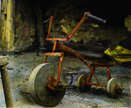 by gornats 11746 views - final score: 63.3% | Stone Travellers 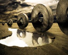 by Toothpick134 17389 views - final score: 61.9% | viking 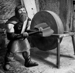 by JamesP 15988 views - final score: 61.4% |
Lure 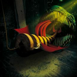 by Stowsk 9128 views - final score: 60.5% | Rainy Day 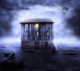 by DanielaOwergoor 13999 views - final score: 58.6% | Wheelbarrow 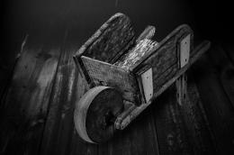 by MrBig 7709 views - final score: 56.3% |
Master and slaves 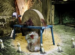 by suni271980 16322 views - final score: 55.9% | FlintStone Wheels 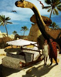 by rjapzdesign 6683 views - final score: 55.7% | The Fiddlestop 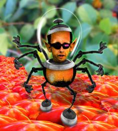 by Drivenslush 5172 views - final score: 54.8% |
The Invasion 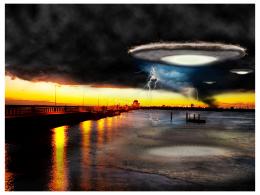 by bcabilan 7626 views - final score: 54.1% | Cheese ? 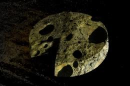 by duma8821 6703 views - final score: 53.8% |
Howdie Guest!
You need to be logged in to rate this entry and participate in the contests!
LOGIN HERE or REGISTER FOR FREE
Well done!
Fantastic drawing, though the background seems too blurred compared to viking imo.
Thanks ladies and gents -
Kid - how do you decide how blurry to make a pic like that - I'm still learning
Nice. Works well. As for the blurring it's really a judgment call. A little sharper background might be good since the drawing is fairly sharp and he's not that far from the wheel for it to lose focus.
I wasn't sure - that control 'f' is easy to use. thanks for the advise though, I'll see what I can do
Very nice entry and in such a short time, well done = )
love this, good luck!!!!
Nice Work...gl
Very very nice work author...gl
Nice work !
Great work!
Love what you have done here and great drawing on the viking! He is an ideal figure for the source image!!!

As for the blur you can create a (sort of) false depth-of-field by duplicating the background layer, blurring it (maybe even a bit more than you already have), then you can add a layer mask and use it to "paint" out the blurred image close to the figure allowing more of the blur to show the further away from it you get. (I hope that makes sense ... let me know if you can't figure out what I am saying and I can try and explain better)
The blend is excellent here. Very well done. Follow ARCA's suggestions about adding depth to this image, it will help to make an already great image even better!
I used 3 layers + masks lowered the opacity of the brush ...

Thanks for all nice word
Very Nice
Congrats!
Congrats!!
congratulation...
Howdie stranger!
If you want to rate this picture or participate in this contest, just:
LOGIN HERE or REGISTER FOR FREE