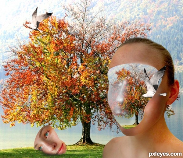
(5 years and 3341 days ago)
3 Sources:
- 1: source1
- 2: source2
- 3: Thanks to f samora
Specimen No. 35  by IDt8r 9136 views - final score: 63.6% | Elegant beauty....  by hereisanoop 10505 views - final score: 63.2% | Metabolic  by MSantos 7971 views - final score: 61% |
storm  by Glam0urGirl2007 8021 views - final score: 59.1% | LA FILLE ET L'OISEAU  by lolu 7600 views - final score: 58.6% | Grave with style 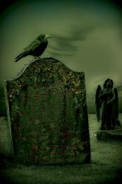 by Mario 7308 views - final score: 58% |
angel of death 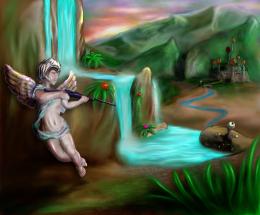 by gornats 7109 views - final score: 57.9% | Sparkling Beauty 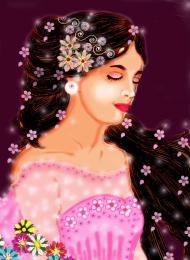 by housy 11322 views - final score: 56% | Smoker 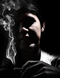 by wrockx 4916 views - final score: 53.8% |
White Fairy in Garden 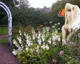 by brownstones 11004 views - final score: 52.2% | Angel on the gates of heaven  by zainemma 16627 views - final score: 51.9% | Creation or Termination? 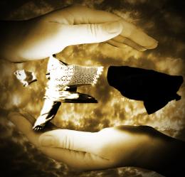 by PSA2009 4408 views - final score: 51.1% |
Howdie Guest!
You need to be logged in to rate this entry and participate in the contests!
LOGIN HERE or REGISTER FOR FREE
beau travail ,bonne chance
Un peu creepy, mais jolie
I believe the idea is that she captures the landscape in her mind.
Man, that's a brave concept and I don't know how i would have done it better, except for Not using the plastic wrap & other filters on her face.
I would also make the composition so that her eye is at 1/3rd of the image and not right in the center.
Add an overlay on the background to enhance colors and desaturate just a bit (maybe also blur) the image in her head! After-all memories are not clear, you can't remember all the details of an image unless you're an autistic.
C'est ton choix de suivre ou non mes suggestions; ci oui et quelque chose n'est pas clair dis-moi.
Je suis tout à fait d'accord avec tes remarques, surtout en ce qui concerne le filtre plastic sur son visage.
Je pense que je vais reprendre cette photo à zero et essayer de l'embellir un peu...
merci pour tes conseils greymval.
I've changed the picture hope you like it !
Well i think it's way better, and I really like it! Now, maybe you should hear other comments too, cause i don't wanna influence your design too much. The composition has improved now, and it's creepy no more
Fantastic,imaginative,effective, surreal...well done author...instant fav from me...best of luck
i think it was better before, it looked like some kind of perception(not memories) and was more original.
Lovely surreal image ... it is nice to see an image that is surreal and not "dark" ... good for you for succeeding so well!
Howdie stranger!
If you want to rate this picture or participate in this contest, just:
LOGIN HERE or REGISTER FOR FREE