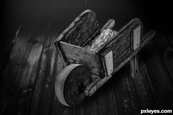
Only source was used to construct the Wheelbarrow.
Background is only external image and a link is included. Comments welcome, please. (5 years and 3338 days ago)
1 Source:
tricycle 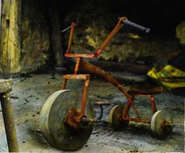 by gornats 11747 views - final score: 63.3% | Stone Travellers 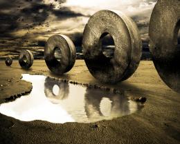 by Toothpick134 17390 views - final score: 61.9% | viking 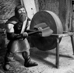 by JamesP 15990 views - final score: 61.4% |
Lure  by Stowsk 9129 views - final score: 60.5% | Rainy Day  by DanielaOwergoor 14000 views - final score: 58.6% | Wheelbarrow 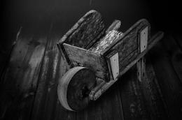 by MrBig 7711 views - final score: 56.3% |
Master and slaves  by suni271980 16323 views - final score: 55.9% | FlintStone Wheels 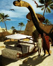 by rjapzdesign 6683 views - final score: 55.7% | The Fiddlestop  by Drivenslush 5172 views - final score: 54.8% |
The Invasion 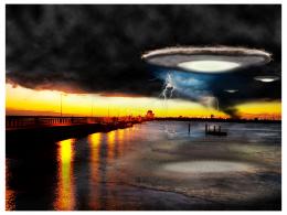 by bcabilan 7626 views - final score: 54.1% | Cheese ? 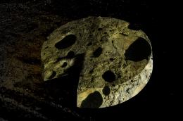 by duma8821 6703 views - final score: 53.8% |
Howdie Guest!
You need to be logged in to rate this entry and participate in the contests!
LOGIN HERE or REGISTER FOR FREE
very nice construction author...cleaver usage of gray scale....best of luck
in the high res - the middle board doesn't seem to match correctly and there is a little bit of a green tint on the leg... well IMO, maybe something to look into - if I were you...
the floor boards are much too wide and detailed , so the wheelbarrow looks like a tiny toy.
it would be nice if the axle of the wheel is visible. good luck
I agree that the scale of the boards makes it look like a toy, which is okay, but the lighting on the front of the wheel and the wheel barrow are not consistent. You have it lit on opposing sides, I'd tone down the contrast on the side of the wheelbarrow.
Great observation, James,
I have adjusted the middle board and must admit that the perspective looks much better. Thank you for your input. I left a bit of the tint on the support leg as that's the way it imported from the source image - upon following your advice, I recognized that by desaturating it - it is more suitable to the piece. Another great suggestion.
The rescaling of the image was intentional to further differentiate the Wheelbarrow from the source with minimal transformation. I will,however; work on producing the axle per your request Gornats. I assume you meant protruding out from the frame to our perspective?
Thanks for the suggestion.
Thanks, Mossy - I agree. I don't know if this adjustment was quite what you had in mind, but I believe it helped add some consistency to the lighting on the image. I used RENDER-LIGHTING EFFECTS-SPOTLIGHT and then brought the intensity down. It created a bit more mood to the image and softened some of the harsh light.
Thank you for your suggestion.
nice work author, good to see you here
Looks good to me, welcome back!
Cool idea; the perspective on the wheel looks odd at the top, like the wheelbarrow is made to turn in a right hand turn.
Thank you for the welcome Wayne, and master Chappell. Feels good to be choppin' again.
As for your observation SGC, I took another look at the psd file and adjusted the perspective a bit. I think it definitely improves the image and adds better balance to the wheel.
Thanks for the help.
Howdie stranger!
If you want to rate this picture or participate in this contest, just:
LOGIN HERE or REGISTER FOR FREE