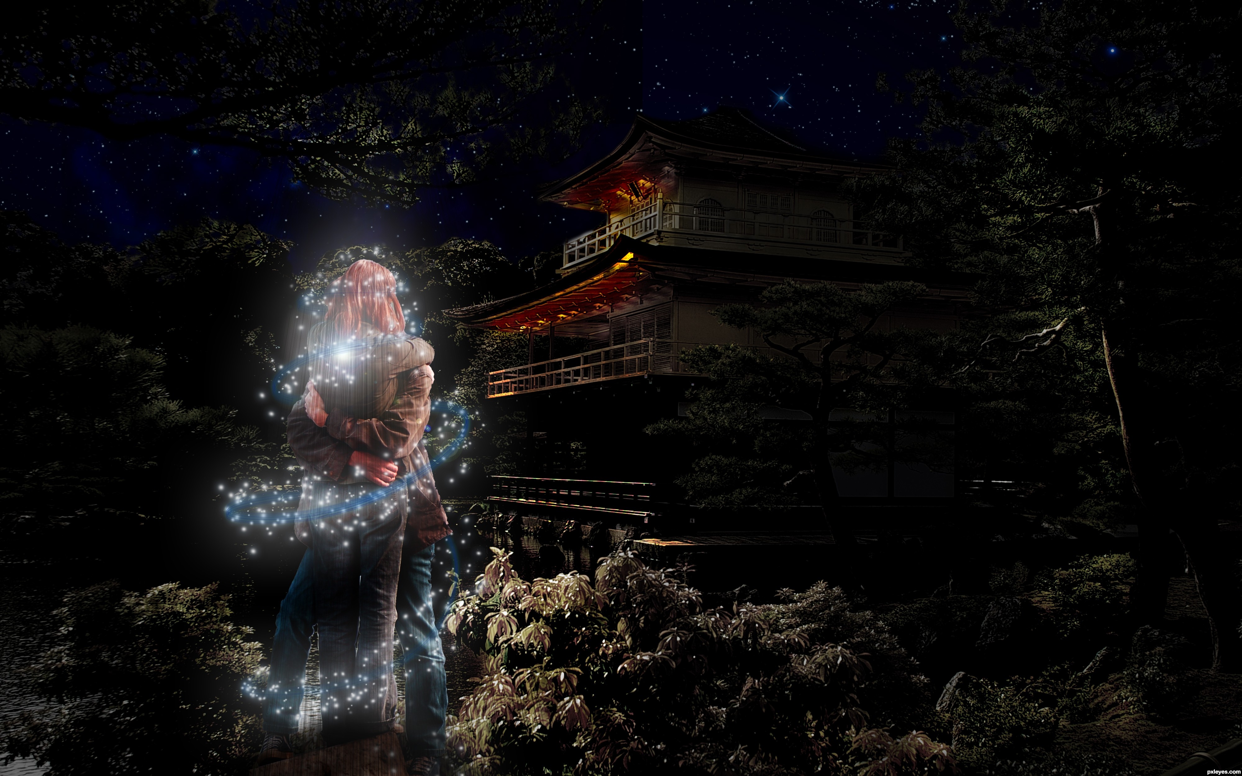
Song is by Coldplay. Hope you like it.
-EDIT- fixed the too dark problem :) (5 years and 3330 days ago)
2 Sources:
Interstellar Overdrive  by arca 19351 views - final score: 65.3% | All My Rowdy Friends  by lchappell 9384 views - final score: 59.1% | Unquity road  by enblanco 8623 views - final score: 58.6% |
Invaders Must Die  by Geexman 10350 views - final score: 57.2% | children of the night  by JamesP 7699 views - final score: 55.1% | Fix you  by apocalips 7102 views - final score: 55.1% |
Space Cowboy  by lchappell 6667 views - final score: 55% | Lovers in Japan/Reign of Love 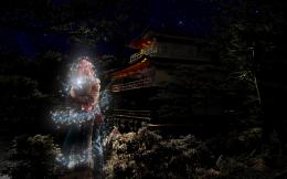 by KingRafox 15899 views - final score: 54.8% | I'm on Fire 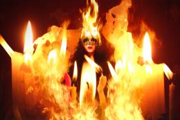 by RickLaMesa 10741 views - final score: 53.7% |
turn to stone 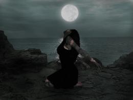 by Se7eN0f9 6281 views - final score: 52.5% | Tiny Dancer in My Hands  by xPutneyx 12327 views - final score: 52.2% | chocolate salty balls  by gornats 8958 views - final score: 51.7% |
Eye of the Tiger  by PSA2009 5916 views - final score: 51.4% | Melting Blue Delicious  by Drivenslush 8702 views - final score: 50.9% | Master of Puppets 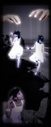 by PSA2009 10909 views - final score: 50.6% |
Howdie Guest!
You need to be logged in to rate this entry and participate in the contests!
LOGIN HERE or REGISTER FOR FREE
Photography and photoshop contests
We are a community of people with
a passion for photography, graphics and art in general.
Every day new photoshop
and photography contests are posted to compete in. We also have one weekly drawing contest
and one weekly 3D contest!
Participation is 100% free!
Just
register and get
started!
Good luck!
© 2015 Pxleyes.com. All rights reserved.


Too dark. Half of your image is so dark, it's very hard to see what is going on, or what you are trying to communicate. Particularly the RH side. The building looks like a facade, with no real back to it, the stars seem to jam right up against the lit front, with the remaining blackness on the right just "dead space."
The figures are almost impossible to make out as a couple, the light swirl is too dominant.
Beautiful concept, just too "moody," with not enough consistent illumination for the viewer to clearly appreciate your efforts.
instead of give the author such negative comment, you could give some advice to improve the image mossyb, maybe its just someone how just get started with ps and then u need some build up comments and not that kind ur give
coldplay 4ever good job
The idea is good, however the image is very dark. Its almost like the saturation and contrast are making this image darker.

With the couple in the foreground, if you took a bit of the sparkles around them off, then they would be a little bit more clearer as well, the you may not need to lighten the image too much more
Goodluck anyway author
Lovely image and great concept ... I agree it is a little dark but only a little ... I have seen a night sky where the stars stand out against a "void" when there is something that you cannot quite make out in front of them. I think a little lightening and some minor toning down of the sparkles would enhance the image .


To lighten you can apply a Levels adjustment layer and brighten it up so the image is "too" light ... then mask out what you don't want to lighten and set opacity to get it just right ...that is if you want to
EDIT: Better!
i think its fine dark... its night time with no lights really... its supposed to be dark. i wouldnt lighten it up any more... if you must go that route in one way or another, instead bring out more details at the focal points to make them more pronounced, and bring in a little more detail in the darker parts to keep it balanced.
Very very nice piece of work...best of luck author
Howdie stranger!
If you want to rate this picture or participate in this contest, just:
LOGIN HERE or REGISTER FOR FREE