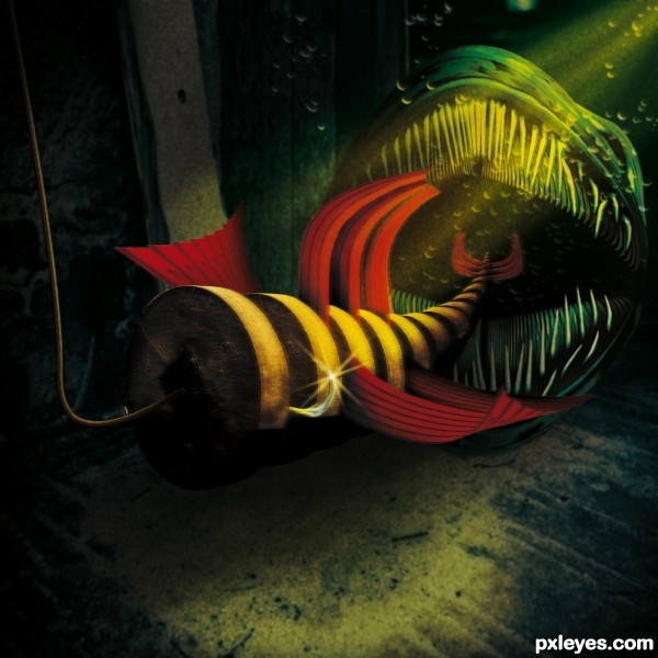
nothimg but the source (5 years and 3332 days ago)
tricycle 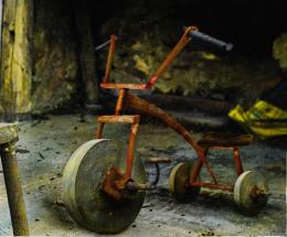 by gornats 11740 views - final score: 63.3% | Stone Travellers 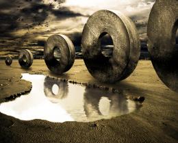 by Toothpick134 17375 views - final score: 61.9% | viking  by JamesP 15980 views - final score: 61.4% |
Lure  by Stowsk 9124 views - final score: 60.5% | Rainy Day  by DanielaOwergoor 13993 views - final score: 58.6% | Wheelbarrow  by MrBig 7703 views - final score: 56.3% |
Master and slaves 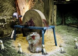 by suni271980 16307 views - final score: 55.9% | FlintStone Wheels 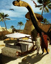 by rjapzdesign 6669 views - final score: 55.7% | The Fiddlestop 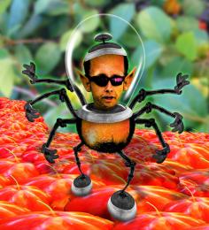 by Drivenslush 5161 views - final score: 54.8% |
The Invasion  by bcabilan 7610 views - final score: 54.1% | Cheese ? 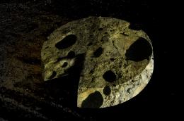 by duma8821 6699 views - final score: 53.8% |
Howdie Guest!
You need to be logged in to rate this entry and participate in the contests!
LOGIN HERE or REGISTER FOR FREE
Creative.. well done
Super duper chop.. but in all honesty.. I think you blurred it too much.. (your steps show a very awesome clear image.. but that's just me.. excellent creation and super fav.. good luck.. but I don't really think you need it) Reminds me of the scene under water in Star Wars Episode 1.. hehehe with all the fish eating the bigger fish.. LOL.. good luck
all IMHO.. of course.. I love this whole concept.. and the work on the teeth is exhausting.. you owe me lots of Starbucks Espresso.. LOL
I agree - awesome pic. your sbs doesn't really explain how the teeth were done - could you give a better explaination?
Really creative use of source! Not sure I'd want to mess with that fish once I 'lured' it.
Great work.
@Drivenslush: I think the blur is indicative of submersion.
great image, only the line for the lure ... i think it should be light gray and a bit transparent , not brownish
Come on; we all know that species of Anguilliformes prefers metalic blue lures... lol
Nice work!
Too dark. It's hard to see and appreciate exactly what's going on. Underwater light wouldn't be such a tightly focused yellow beam from the upper corner.
I love your work! Something surreal, like a dream!
Fantastic piece of work author...There is few great elements fitted perfectly with the overall mood...well done
Thanks for the comment James P. The back teeth were made by creating one tooth. Step and repeat, then warp and add shape. The front teeth were simply brushed and smudged.
Thanks MossyB. a light source can be very tightly focused. I left no indication what created the light.
If you want Realism...take a picture.
Great and creepy creature work!!! Love what you have done and the colours and composition are excellent!
Brilliant work! To all who question the blur - IMHO it's MOVING! being sucked down the throat of that beast in the back. Great cleanup job, author, and really creative work.
Thanks all.
Pearlie and Mr. Big, thanks for explaining the movement in water. Movement in water diffuses all, kicks up sediment and all that schtuff. Even the the cleanest waters change appearance.
Howdie stranger!
If you want to rate this picture or participate in this contest, just:
LOGIN HERE or REGISTER FOR FREE