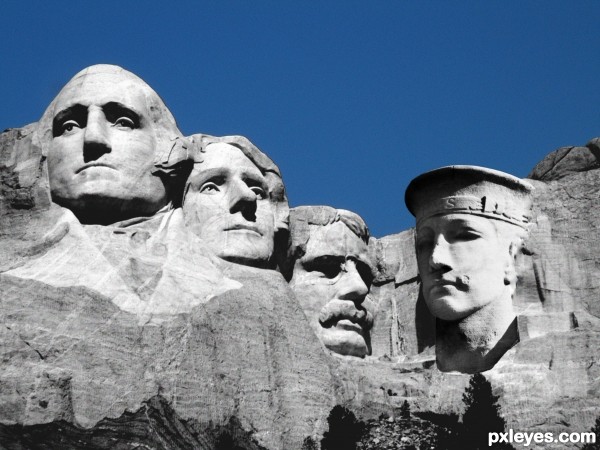
(5 years and 3312 days ago)
1 Source:
Mount Rushmore...plus one.  by elliejane 16591 views - final score: 58.3% | Game  by Chalty669 7005 views - final score: 57.2% | Face Lift  by Chuck 8446 views - final score: 53.5% |
HMS soldier in USA 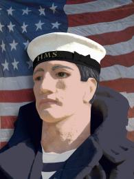 by sdaniela 9321 views - final score: 52.9% | old house 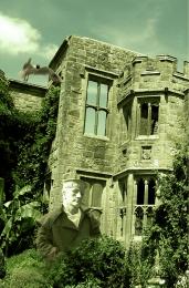 by ramesan 8662 views - final score: 52.1% | Who's that 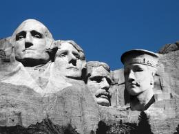 by rjapzdesign 5481 views - final score: 52% |
Black City 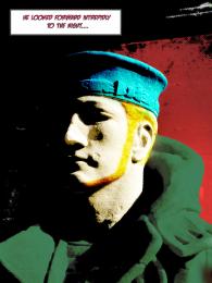 by Mitchbiucannon 8412 views - final score: 51.4% | Who needs enemies? 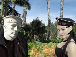 by sgc 6145 views - final score: 50.7% | Hitlers MouStache 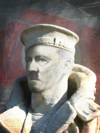 by dannifood4less 6796 views - final score: 47.6% |
white statue No:2 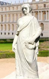 by ramesan 4527 views - final score: 47.6% |
Howdie Guest!
You need to be logged in to rate this entry and participate in the contests!
LOGIN HERE or REGISTER FOR FREE
NIce idea. Fits good into the source. Try to darken the white parts of the mountain (by his ear and hat) and maybe make his stone also with some straight "stonelines" it will be even better. But I like this a lot anyway! GL
Very imaginative, but the shadows are facing the opposite side of the rest of the image. Perhaps you should reverse the sailor's face...
lol you tricked me author! i thought it was a picture of mt. rushmore until i looked to the right of the image! great job! good luck as well
nice idea.....but it need a lot of work on the shadows of neck & face good luck author............
Hello guys, and thanks for the heads up and comments. I see the shadows that are not all are in the right place, that's cause of original shadows, sun made, but I been fulling around with magic wand tool to select the shadow area, levels and brightness & contrast to lighten up the shadow area to look bright and not lose quality, like the other side. Im working on it.
cool work author...gl
nice work author ..good luck !!
Howdie stranger!
If you want to rate this picture or participate in this contest, just:
LOGIN HERE or REGISTER FOR FREE