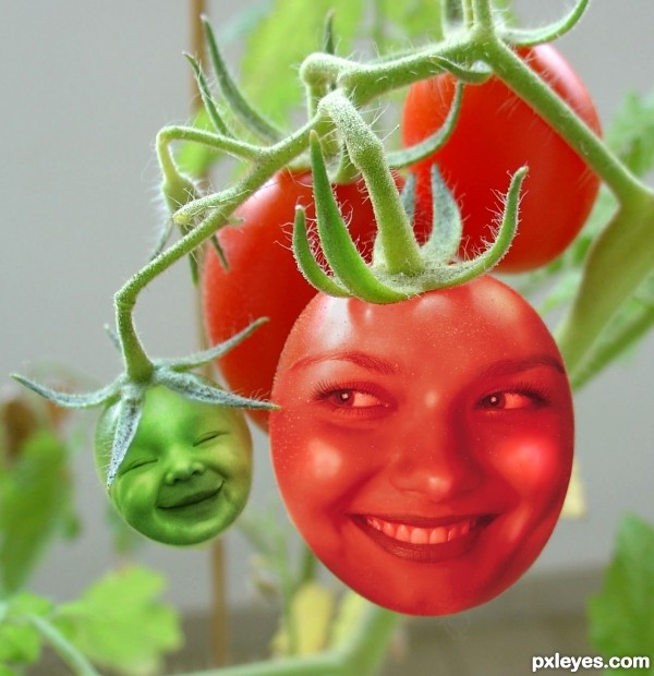
Desaturation of face images, with simple Cut & Paste and Layer Blend Mode changes.
A little Liquify to emphasize the baby's smile, and a bit of touch up painting to even tones. (5 years and 3399 days ago)
2 Sources:
Heart Sucker  by jaskier 13116 views - final score: 67.6% | Legend  by Stowsk 11010 views - final score: 62.6% | Floating Fantasy  by petersheep 23082 views - final score: 62.2% |
crazy tomatos  by samanway 13742 views - final score: 61% | Life in Tomato  by abyglobal 15650 views - final score: 57.8% | seeds of hope  by gornats 8539 views - final score: 56.8% |
Arthropoda Nearsightedness  by Drivenslush 6924 views - final score: 56.1% | CRISTAL TOMATO  by cterraza 8227 views - final score: 55.9% | strawberry  by lolu 8566 views - final score: 55.1% |
flying tomato  by Sandysanju 9658 views - final score: 54.9% | DeadMario  by Bibs 26862 views - final score: 54.6% | Octopus Tomato  by willianmachado 12544 views - final score: 53.7% |
Tomato Tot 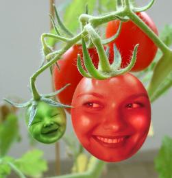 by MossyB 13114 views - final score: 52.9% | Tomato Juice 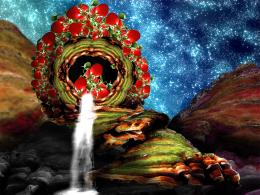 by Drivenslush 9660 views - final score: 52.7% | From Seed 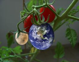 by jbillitteri 8060 views - final score: 52.1% |
He's going for the plant  by irish1967 8147 views - final score: 51.9% | poor harvest 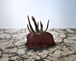 by zambrottix 11694 views - final score: 51.9% | Tomato guy! 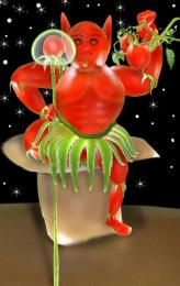 by shaiju1974 6419 views - final score: 51.5% |
Factory Picked 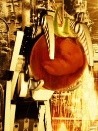 by igogolf 6716 views - final score: 51% | hey there mr tomato head 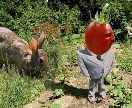 by JamesP 12839 views - final score: 50.3% | Darkness Gift 004  by locxoul 7117 views - final score: 47.3% |
Howdie Guest!
You need to be logged in to rate this entry and participate in the contests!
LOGIN HERE or REGISTER FOR FREE
The dimensionality of the baby head really works, but the "mom head" needs to have the same quality...right now she looks like an inflated balloon. Suggestion would be to do some dodge/burn on her, or shading & highlights on adjustment layers. GL author.
Good call, CMYK, thanks!
The light intensity on the plant and kid face is different. You should add some highlights on the baby's cheek and nose (with some bright green or pale yellow) to get rid of this. good luck
I see you've changed her face. I like this one much better! She relates much better to the baby. Cute idea nicely done! (Just one tiny nit pick, there's some edges showing on the right and lower right side.)
Swordfish and Spaceranger, THANK YOU so very much!
"Too close to the trees (or tomatoes) to see the forest (or edges and lighting)..."
It always helps to have other eyes to spot the small things. That's what helps me improve!
Thank you again!
Red tomato face looks flat, since this isnt a very original concept there are lots of tutorials to show you how it should be done, hope this helps.

http://jengrantmorris.blogspot.com/2007/10/fruit-faces-tutorial.html
Good luck
Nice tutorial, Geexman, but the result is too "bright" for this image. Trying to erase the forehead and cheeks made the face too dark, going back to the "balloon" effect CMYK pointed out with the previous face, and erasing back to the original image made the teeth and the eyes WAY too bright...Oranges and tomatoes just don't quite work the same...But thanks for thinking of me and trying to help.
Very sweet!
Adorable!!
That baby is just ADORABLE! The woman's cheeks look nice. I just don't like her teeth and eyes. But the baby gets high marks from me!
Very cool...love the idea that both of them are smiling...gl
Howdie stranger!
If you want to rate this picture or participate in this contest, just:
LOGIN HERE or REGISTER FOR FREE