(5 years and 3311 days ago)
mystic barque  by gornats 9638 views - final score: 60.8% | in the Rain  by dreamboy 19444 views - final score: 60.1% | Bejeweled Fantasy  by artgirl1935 16117 views - final score: 59.7% |
Spring board 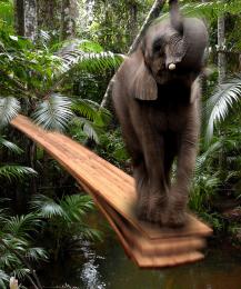 by filantrop 10346 views - final score: 57.9% | wolf 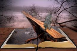 by Se7eN0f9 7541 views - final score: 56% | When disaster strikes... 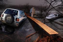 by bcabilan 6288 views - final score: 54.8% |
House at the lake 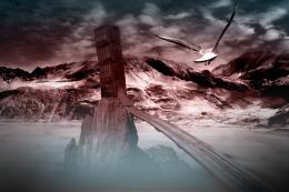 by Mitchbiucannon 7950 views - final score: 54.5% | walk way between heaven & hell 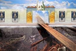 by Sandysanju 10964 views - final score: 54.3% | JOB 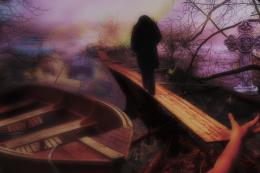 by woodztockr 6561 views - final score: 54.2% |
Serpent Kingdom 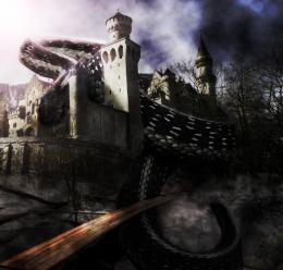 by woodztockr 6122 views - final score: 53.4% | chase 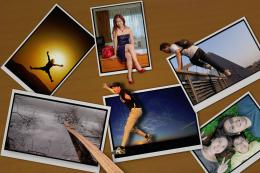 by kenchoy25 6402 views - final score: 53.1% | about swans and transportation 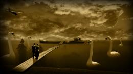 by Mitchbiucannon 11948 views - final score: 52.6% |
Just Fishing 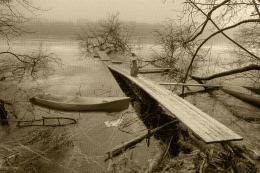 by sodoff 8040 views - final score: 51.8% | Getting Home 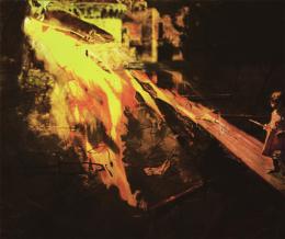 by woodztockr 5583 views - final score: 50.1% |
Howdie Guest!
You need to be logged in to rate this entry and participate in the contests!
LOGIN HERE or REGISTER FOR FREE
Interesting concept. The execution is lacking on several levels. GL author.
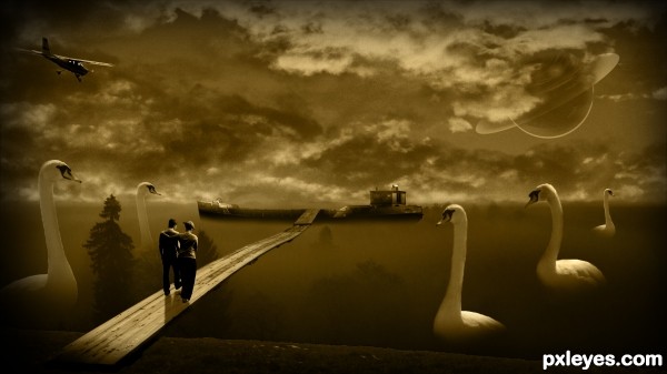
The overall lighting is too dark, with the birds on the RH side exceptionally so.
The dark shape between the two birds on the left (a tree, perhaps?) is so dark and undefined as to be visually confusing.
The couple are so dark that it appears that they only have 2 1/2 legs between them.
The "star" blobs in the sky are inconsistent, and illogical being in front of the clouds, but Saturn suffers the same confusion...
This is a really nice concept, but the execution seems rushed and not well thought out. Even for a dream, it leaves a bit to be desired.
Howdie stranger!
If you want to rate this picture or participate in this contest, just:
LOGIN HERE or REGISTER FOR FREE