(5 years and 3304 days ago)
10 Sources:
LES QUINTUPLES  by lolu 15150 views - final score: 60.4% | Feel Good 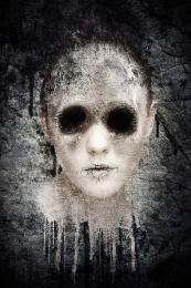 by ponti55 18975 views - final score: 60.3% | Veil  by Stowsk 14108 views - final score: 60.1% |
home sick 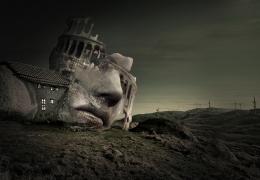 by dekwid 13876 views - final score: 59.8% | Shroom Head 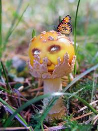 by RickLaMesa 14571 views - final score: 57.5% | NO SPEAK  by rakib888 5992 views - final score: 57.5% |
Limitless  by Tuckinator 5681 views - final score: 56.5% | Quack?  by ponti55 6444 views - final score: 56.3% | octopus  by Se7eN0f9 14532 views - final score: 55.9% |
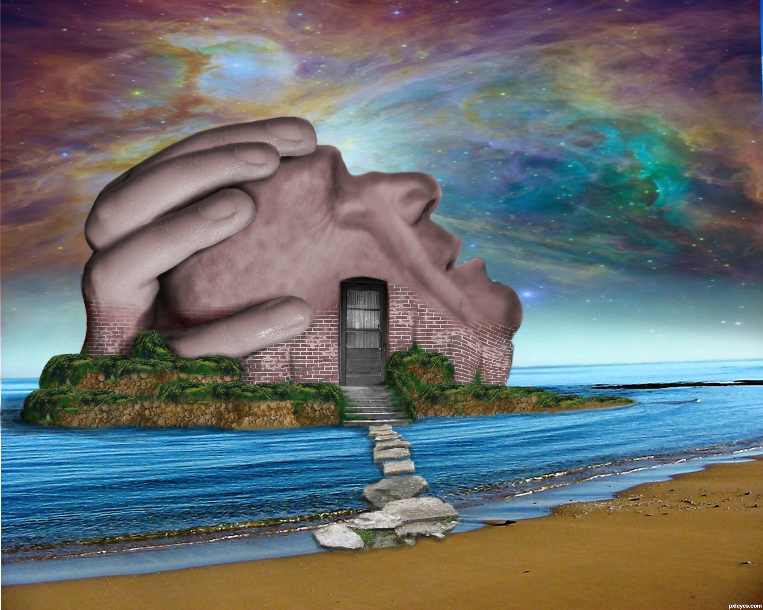
mask out  by zambrottix 9042 views - final score: 55.7% | Real  by samanway 7273 views - final score: 55.1% | Home of the mind 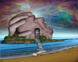 by JamesP 7913 views - final score: 55% |
Phobia  by Brandon 6954 views - final score: 54.7% | puma baby  by Se7eN0f9 11913 views - final score: 54.3% | Illuminate  by pixelkid 5645 views - final score: 54.1% |
overexposed  by gornats 6230 views - final score: 53.9% | OLD BEAR  by DYNOSSAURUS 12249 views - final score: 53.5% | IN FACE  by lolu 5683 views - final score: 51.3% |
Kiss  by filantrop 5710 views - final score: 51.2% | split face  by jack2 7996 views - final score: 50.8% | Snorky Snorkel Snork Snork  by Drivenslush 7607 views - final score: 50.3% |
Devil Collects It with a Grin  by Drivenslush 7226 views - final score: 50.1% | d outcast  by jack2 4237 views - final score: 49.3% |
Howdie Guest!
You need to be logged in to rate this entry and participate in the contests!
LOGIN HERE or REGISTER FOR FREE
Photography and photoshop contests
We are a community of people with
a passion for photography, graphics and art in general.
Every day new photoshop
and photography contests are posted to compete in. We also have one weekly drawing contest
and one weekly 3D contest!
Participation is 100% free!
Just
register and get
started!
Good luck!
© 2015 Pxleyes.com. All rights reserved.


nice work you need to add shadows to blend imo
i agree with nisha. i like you concept, definitely, but just a few little things i might add... bringing some of the brick texture up onto the face to blend it in better...some shadows and stuff...and then, also, blur the horizon so it gives it more depth. also..and not to be picky, but just trying to help... i think the yellow of the stones going into the water is too bright. perhaps lower the saturation so it blends better with the image as a whole.
Thanks for the comments, I tried to fix must or you suggestions - the bricks on the face are still stumping me though...
You've done a lot of cool work here which would be easier to appreciate if you included an SBS. I'm not sure I agree with the relative simplicity of the foreground/midground against the complexity of the background. The perfectly horizontal panels in the door are at odds with the tilted horizon in the background.
I have to agree with most of whats been said, great concept but a little more work on the blending factors.... best of luck
Howdie stranger!
If you want to rate this picture or participate in this contest, just:
LOGIN HERE or REGISTER FOR FREE