
(5 years and 3390 days ago)
1 Source:
- 1: Lamb Chops
Explorer's stew 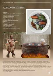 by minnie 5616 views - final score: 60% | Sinful Hot Chocolate 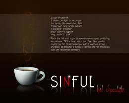 by jscyphers 8195 views - final score: 56.2% | Chocolate Decadence 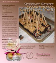 by pearlie 7019 views - final score: 56.1% |
Hey,Let's Get Out of Here!!!! 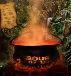 by artgirl1935 13334 views - final score: 55.2% | Lamb Chops with Asparagus 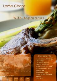 by Toothpick134 11851 views - final score: 55% | My dinner 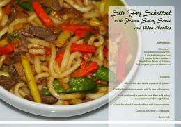 by ibmaxed 4845 views - final score: 53.7% |
Thai 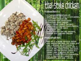 by filantrop 3577 views - final score: 53.1% | Summer Treat 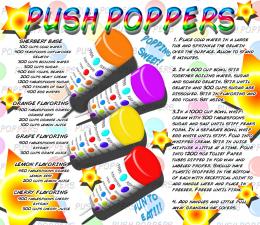 by Drivenslush 4409 views - final score: 53.1% | Eggs 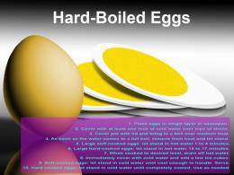 by filantrop 3418 views - final score: 51.3% |
Howdie Guest!
You need to be logged in to rate this entry and participate in the contests!
LOGIN HERE or REGISTER FOR FREE
Sounds delicious, but the light reflection off the pork chop is too high contrast, looking more like a glare than a highlight.
You've also misspelled "ingredients."
Ohh thank you i didn't notice.. must have pressed "e" twice by accident...

I'll fix the contrast too
the text of your description need to be centered to the panel with an equal gap seperating the 2 columns and give more space on the left side text (its a guillotine operators nightmare).......sorry to be picky but I do this for a living
Sounds good, but the small text is barely readable in high res.
Right on theme with an upscale-magazine layout. Unfortunately, the glare on the pork chop hides the central ingredient. I think making "Lamb Chops" and "With Asparagus" bigger and having the former slightly overlap the latter could be more dramatic. Also, traditionally the ingredients come first (i.e., on the left side here) followed by the instructions (i.e., on the right side here). (I suppose alternatively having the ingredients higher than the instructions might visually convey the traditional ordering arrangement even if the physical arrangement is non-traditional.)
Very nice! GL!
Howdie stranger!
If you want to rate this picture or participate in this contest, just:
LOGIN HERE or REGISTER FOR FREE