size:-728 x 90
general
no outside source is used beside the pxl logo (5 years and 3271 days ago)
pxl banners 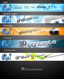 by samanway 11523 views - final score: 61.7% | 3D Contest Banner 300x600  by genuine2009 10992 views - final score: 60.8% | PXLEyes  by fatz8016 7065 views - final score: 59.4% |
Photography  by jaskier 7776 views - final score: 58.7% | Banners  by Skye 7418 views - final score: 58.3% | Photoshop tuts  by MrLumbee 7746 views - final score: 57.5% |
Photoshop Contests Banner 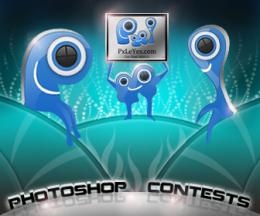 by Siddhartha 7109 views - final score: 57.2% | RE WOW!  by genuine2009 5120 views - final score: 57.1% | graphical artists paradise 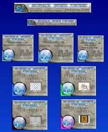 by gornats 6044 views - final score: 57% |
Contests 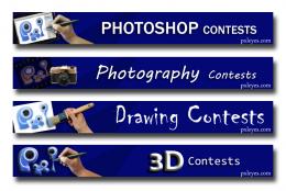 by rbrum 5471 views - final score: 57% | PS  by dekwid 2920 views - final score: 56.9% | pxleyes 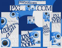 by CrystleClear 7853 views - final score: 56.7% |
commounity of passion  by rakib888 5306 views - final score: 55.9% | PXL BANNERS 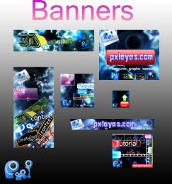 by itsdesign 6317 views - final score: 55.3% | Tutorial PXLEYES banner  by genuine2009 10565 views - final score: 54.9% |
click here ad pack 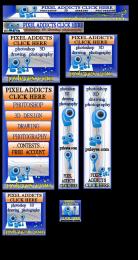 by gornats 6656 views - final score: 54.5% |
Howdie Guest!
You need to be logged in to rate this entry and participate in the contests!
LOGIN HERE or REGISTER FOR FREE
Photography and photoshop contests
We are a community of people with
a passion for photography, graphics and art in general.
Every day new photoshop
and photography contests are posted to compete in. We also have one weekly drawing contest
and one weekly 3D contest!
Participation is 100% free!
Just
register and get
started!
Good luck!
© 2015 Pxleyes.com. All rights reserved.


"with passion of pixel" can mean community with a very small passion , i think you need different phrase

p.s. sometimes this is completely true
LOL YEAH. but I have changed it.
It's quite pretty.. good luck
Very nice work here!
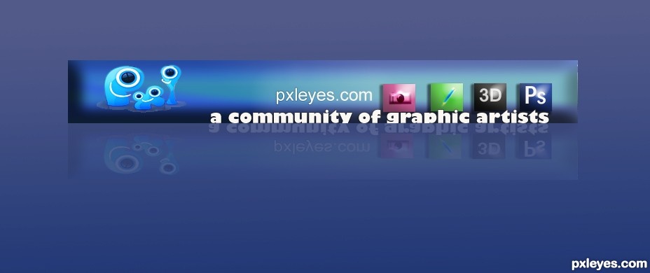
Not bad, but the logo straight on a blue background doesnt work well imo. It needs more contrast or you'd hardly be able to see it (while it should be one one of the more important elements in the banner). The icons are ok, I'd recommend a better aligning inbetween the icons. I'm not completely sure about the tagline, since there are also photographers and perhaps they dont see themselves as graphic artists. And well, I'd add a "s" to artist. Good luck!
thanks guys ..when comes to tag line always got confused..I couldn't find a great tag line ..any one have any recommendation?about the tag line?It would help to improve the entry..please share
lovin the 4 glossy buttons on the right of the add! well done (just a thought to add pxleyes.com somewhere!) good luck
I like it! Very appealing
There shouldn't be an apostrophe in "artists". Also, the reflection should be proportional to the type above.
great catch crystleclear..and thanks every one
Sorry to belabor the point, but the reflection is still wrong.
Very nice work author...GL
I don't get how all of this would be used as a banner on a Web site. The apparent reflection doesn't line up with the 'real text' (so the reflection doesn't look like a true reflection) and I don't understand why the below-the-base-line portions of the 'real text' have been cut off. Furthermore, I would think "pxleyes" should be the most prominent element, not the tag line.
Dan not all of this would be use as a banner the banner is the bar of 728*90 pixel main bar which contains the buttons..putting it in the blue background is just a way of representing.the main file does not contains the background or reflection.thanks for asking
Howdie stranger!
If you want to rate this picture or participate in this contest, just:
LOGIN HERE or REGISTER FOR FREE