
if u dont like a thing then please say i ll try to change it> media :photoshop
special thanx \credits
1.Falln-Stock
2.Adorama (5 years and 3288 days ago)
pxl banners  by samanway 11548 views - final score: 61.7% | 3D Contest Banner 300x600  by genuine2009 11018 views - final score: 60.8% | PXLEyes  by fatz8016 7081 views - final score: 59.4% |
Photography 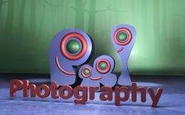 by jaskier 7789 views - final score: 58.7% | Banners 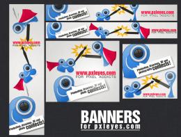 by Skye 7430 views - final score: 58.3% | Photoshop tuts  by MrLumbee 7760 views - final score: 57.5% |
Photoshop Contests Banner 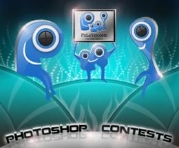 by Siddhartha 7124 views - final score: 57.2% | RE WOW!  by genuine2009 5127 views - final score: 57.1% | graphical artists paradise  by gornats 6056 views - final score: 57% |
Contests 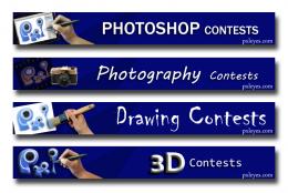 by rbrum 5479 views - final score: 57% | PS  by dekwid 2927 views - final score: 56.9% | pxleyes  by CrystleClear 7874 views - final score: 56.7% |
commounity of passion  by rakib888 5323 views - final score: 55.9% | PXL BANNERS 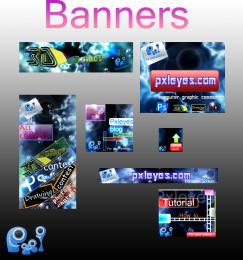 by itsdesign 6338 views - final score: 55.3% | Tutorial PXLEYES banner  by genuine2009 10592 views - final score: 54.9% |
click here ad pack 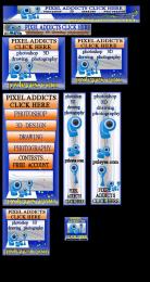 by gornats 6667 views - final score: 54.5% |
Howdie Guest!
You need to be logged in to rate this entry and participate in the contests!
LOGIN HERE or REGISTER FOR FREE
Photography and photoshop contests
We are a community of people with
a passion for photography, graphics and art in general.
Every day new photoshop
and photography contests are posted to compete in. We also have one weekly drawing contest
and one weekly 3D contest!
Participation is 100% free!
Just
register and get
started!
Good luck!
© 2015 Pxleyes.com. All rights reserved.


The paint in the last banner should end at the tip of the brush, imo. (That part behind the brush should be erased.
You have some nice banners, but I'm not a fan of the first one: when you say addicted you don't associate with gray, maybe with red instead, or a more vibrant color.
The photography banner has a painted camera, i think you're allowed to use stock for this contest, if so, maybe a real camera would fit better - if not, make some Polaroid pictures in photoshop.. or a photographic film.
Good luck!
thanx
Love the colors you've used! They would catch my eye and make me want to click to check out the site for sure!
As said above, nice use of colors. They're bright without being overdone, looks professional. As a serie the banners are not bad, eventhough you used different solutions for each of the banners, the colors and use of texture brings them together. What you could do is put the logo always on the same place and perhaps use a same way to show what contest you want to advertise (i.e. the way you put the PS contest can also be done for the others). I like it that you put that photoshop window in a same direction as the text, I kinda miss that in the other banners. The whole setup from the PS banner (logo left, texture as background, diagonal text for the contest in the middle and in the right an image) could work for all, and you kind of did it but with some of them it works better than the others (example, for the 3D banner you illustrated the 3D part in the text itself instead of an extra image, is a different solution than the rest). Not that I dont like each of them, it certainly has potentional. It's more up to you what you'd like as serie. Ow, and I certainly agree with greymval about the camera, a real image would increase the power of the banner a lot. Good luck!
well did some changes thanx
thanx
& also i hv changed the first banner which was on red .
Fantastic piece author...One of the best in the contest for now...Best of luck
thanx erathion
This is what we called, GREATNESS! You have a good taste and wild imagination author and the result is perfect. GL!
thanx man
good 1
thanx
wow i can see a winner here great job

thanx for ur wonderful comment
Great work here = )
thanx Emik
Very cool banners, especially the 3D Contests one
Congrats!! Good designs!
Congrats, well done
congratulation!!!
hey u won wow! congrats!!!!!!!!!!!!!!!!

Howdie stranger!
If you want to rate this picture or participate in this contest, just:
LOGIN HERE or REGISTER FOR FREE