(5 years and 3261 days ago)
oL  by anapt 13106 views - final score: 64.9% | summer  by macarhign 8657 views - final score: 63.1% | Framed  by rbrum 10711 views - final score: 60.6% |
Picture 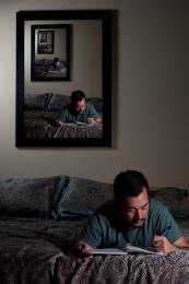 by rbrum 8885 views - final score: 60.5% | hebda 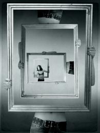 by anapt 10550 views - final score: 59.8% | Drawing hand 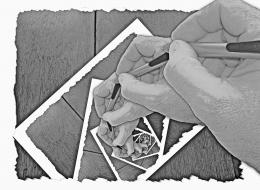 by minnie 10141 views - final score: 59.2% |
droste effect laptop  by janetww 16485 views - final score: 59.1% | Spectacular Spectacles 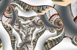 by Christy 6168 views - final score: 57.7% | Time 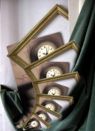 by mazanda 4914 views - final score: 57.3% |
Snow Frame 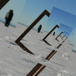 by Christy 8163 views - final score: 56.7% | Chess 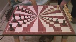 by igogolf 7096 views - final score: 56.2% | Mustard Stairs 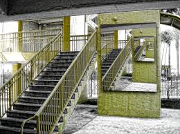 by Drivenslush 6915 views - final score: 56.1% |
iDroste 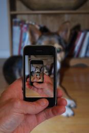 by chaplain 7134 views - final score: 56.1% | say ahh... 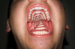 by westfall 17215 views - final score: 55.9% | angry cat 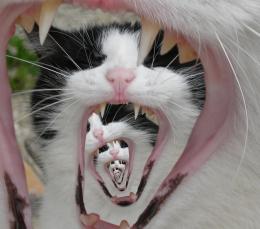 by macarhign 19939 views - final score: 55.8% |
Escalator Madness 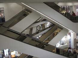 by Majkman 6444 views - final score: 55.3% | MMMMM! Beer! Doh! 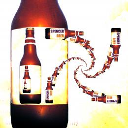 by Drivenslush 8026 views - final score: 53.5% | Tad 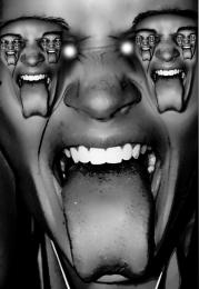 by Drivenslush 4694 views - final score: 52.9% |
Double Droste  by Majkman 5390 views - final score: 51.5% |
Howdie Guest!
You need to be logged in to rate this entry and participate in the contests!
LOGIN HERE or REGISTER FOR FREE
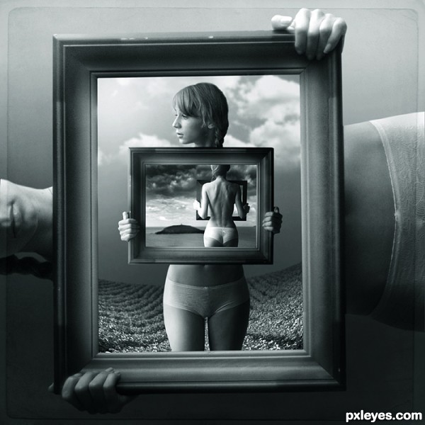
Author, your work is interesting, and technically good. The problem is, after we've seen the monochromatic stylizations, it is no longer anonymous.
this is not my problem
Hmmm... I don't think this qualifies for the Droste Effect, as the image changes in every subsequent image.
Sorry, it's a nice image though.
main idea is stil the same... i sugest not to think so straight
There are an awful lot of people who don't think laterally on this site which is odd. I like what you have done monochrome or not
It ends so isn't it incorrect for the effect.
Author, anything that makes your entries not anonymous is indeed your problem.
There are other artists whose work is easily identifiable, and at far lesser quality than this. As with any artist's style, some will like it, some won't. Just as those with poor quality who are easily identified by their style are identified, it will all "come out in the wash," and the voting will decide.
It's NOT the author's problem, it is his style. If you disagree, flag it, let the mods tell the author he can't create in his own style because it is identifiable.
I far prefer this to simple repetitive patterns trying to pass themselves off as droste effects...
I love your work author, it's brilliant and I enjoy it very much
very classy work....
Pie at the Y; tastfully exectuted... I think Droste would agree, being he was an artist; no?
ok CMYK46, let say it is my problem... what should i do? what is Your suggestion?
my suggestion is that you remain anonymous so than people wont vote low on your entries once you piss someone off with high vote power.
I love this entry, Hi-res could be possible? GL!
Great job!
Love this , beautiful

I like it and do not know this Author btw. Good luck Sunday. I wish you had hi-res though.
Oriel has made a very good point here, which is odd for an art community to not think outside the box, but I don't think it is many as they stand out in the crowd imo.
Cheers
no hi res due to copyright protection... sorry
Huh author, this is fantastic piece of work, great imagination, style, execution, everything...But IMHO this is not pure droste...On side with that,your attitude about Hi Resolution is not welcomed, for me for sure its not, cause this is side with contests and u participate in contest, and for all of us high resolution is very important because we want to see all details, all good things and all faults, and that is visible only in high resolution. That things are important for better evaluation of entry...Also i understand your point...any how i wish u best of luck
i understand Your point... however... if i upload hi-res file, somebody may download it and print it out.... i can't allow this
I understand what you mean about the printing/copyright issues with the high resolution and for a neat work like this, I would feel the same. BUT, you have to take into consideration that some voters MAY vote lower for the simple fact that they can't see the WORK put into the photoshopping. Wrong or right, that's the chance you have to take.
I don't know enough about the droste effect but I always thought it was supposed to be an exact replica of the first image. Either way, I like this and believe you should frame it (no pun intended) and put it on a wall!
this piece exist on the wall allready... on my exhibition

and again about droste: try to go little futher than "the same pose" "the same object"
as for the hi-res... my copyrights are more important to me... i don't have pressure to win for any price
I love this piece, and I even love the fact that you put your style in it. There are so many artist on here that are recognizable by their works. Once you post enough photos, people will begin to recognize your style, plus, it takes talent to create a series of pieces in the same style, but have each one be it's own piece, I also think it takes a lot of talent for an artist to be diverse, but I think it is easier to be diverse than consistent. I really admire your work, your abstract thinking, and the way to twist and bend the rules. People forget that at isn't inside a box.
Congrats!!
Congrats Wonderful work
congratulation!!!
Congrats.,great work
Congratulations. Well deserved win.
Howdie stranger!
If you want to rate this picture or participate in this contest, just:
LOGIN HERE or REGISTER FOR FREE