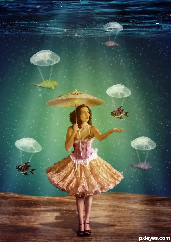
(5 years and 3272 days ago)
6 Sources:
- 1: model by magikstock
- 2: source2
- 3: source3
- 4: source4
- 5: fish by pausimausi
- 6: source6

(5 years and 3272 days ago)
A Sweet Pasture  by pixelkid 22520 views - final score: 70.2% | fishing in the sky  by Neese 26574 views - final score: 67.4% | Parachute  by nanaris 18980 views - final score: 65.4% |
Conquering the moon  by bcabilan 14278 views - final score: 61.2% | Jack peas  by filantrop 13544 views - final score: 59.7% | ram it down  by dekwid 6472 views - final score: 59.4% |
Landing.  by filantrop 4721 views - final score: 59.3% | BATH TIME  by lolu 5430 views - final score: 58.8% | under my skin  by dante 11076 views - final score: 58.4% |
Calliope Adrift  by Drivenslush 7484 views - final score: 57.2% | Bringing prints to life  by Glockman 7180 views - final score: 57% | ...something fishy...  by gornats 8266 views - final score: 56.3% |
Cutting Through 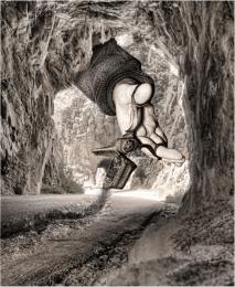 by Drivenslush 7440 views - final score: 56.1% | The Sod Turning  by Majkman 12127 views - final score: 56% | ImpossibleTubision  by woodztockr 6853 views - final score: 50.5% |
True Beauty (Upside down?)  by woodztockr 10935 views - final score: 49.3% |
Howdie Guest!
You need to be logged in to rate this entry and participate in the contests!
LOGIN HERE or REGISTER FOR FREE
Very cool, what a great idea about the jellyfish = )
very creative! good luck!
Thank you Androla and Emik !
Awesome idea with the jellyfish as parachutes for the fish, nice chromatics and mood, as well.
I'm not a fan of:
1. Background. No idea if it's an aquarium or the ocean. In the first one you would have some form of "back" of the BG, like an outside word ( you could have made this look like a bubble/ bubble tank, enhancing your composition ). In the ocean, the floor would go further away losing itself in a blurred underwater horizon, or if it's the edge of an abyss you would see the other edge or some seamountains etc.
2. Fish. You only have 2 species repeated a few times with minor hue & scale change, even bubbles on them are the same -makes this very boring. Try using more species and more numbers, maybe a cluster in the background, one very close in the foreground, in order to create More Depth & variety. ( they can also be partially outside the screen.
3. Shadow cast. a) It should be a little more oblique since light comes more from the left, than from the front. b) Dress & umbrella would create a projected ellipse shadow, not a triangle. ( credits for this info: CMYK & his comment on my entry on mushroom shadows).
I wanna make sure that you know: I do appreciate your effort & idea, and I'm only commenting cause I see lots of potential in this entry. With some more time investment it would truly be outstanding.
Thank you Nator!
Grey thank you for your help , I will see If I will change something!
i love it ,good luck
This is so, Lil Bo peep, lol, where are the sheep, love this entry!
Congrats for 3rd
Congrats for the 3rd!
thank you!
Congrats
Howdie stranger!
If you want to rate this picture or participate in this contest, just:
LOGIN HERE or REGISTER FOR FREE