(5 years and 3263 days ago)
1 Source:
- 1: lambo
Colored into miror  by mazanda 16469 views - final score: 66.9% | Fry's hot rod  by gornats 11523 views - final score: 66.6% | Colored  by freejay 9378 views - final score: 66% |
robbery  by kushpatel 7515 views - final score: 60.1% | Baby's First Words: WTF?!?  by Drivenslush 12408 views - final score: 58.9% | Oooh, I Like That 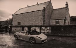 by layerstack 6424 views - final score: 56.2% |
Howdie Guest!
You need to be logged in to rate this entry and participate in the contests!
LOGIN HERE or REGISTER FOR FREE
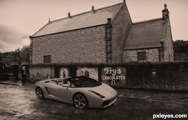
Looks better in Hi-res...imho
The cloning of the stones on the large wall looks too patterned, with a couple really noticeable stripes running across...
The top of the wall with the advertising is too lumpy and blurry. You need to clean up and even that wall top edge...
And the "new" car is too sharp of focus for the rest of the image. If you gave it just the slightest bit of a layer blur, it would better fit into the image.
@ mossyb, thanks for taking the time to comment. I've made suggested changes


But please understand there is not much image for me to clone
Considering the source image i dont think i done a bad job........
Cheers mate
You certainly did not do a bad job author !!

Would be cool to make the house less borring ?
Mayby by using parts of the beamisch tram ?(window for house windows)
Wel good luck author !!
I know the car is like that in the original image, but in the entry it seems to me as if it has flat tyres. Maybe you could "inflate" them a bit...
Good work author!
Howdie stranger!
If you want to rate this picture or participate in this contest, just:
LOGIN HERE or REGISTER FOR FREE