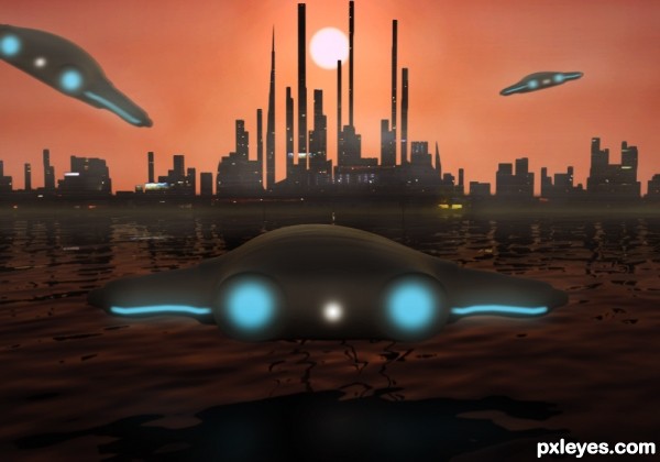
(5 years and 3265 days ago)
1 Source:
- 1: city lights
My precious  by nanaris 12511 views - final score: 69.8% | Elf in the woods  by ushurani 16540 views - final score: 66.8% | Mya's Ark  by Christy 15251 views - final score: 65.8% |
Face  by erikuri 11643 views - final score: 64.4% | Rafting  by filantrop 8163 views - final score: 63.4% | In my dreams  by nanaris 8319 views - final score: 62.8% |
Splatter Attack 1  by rufkut 10212 views - final score: 62.2% | Coming Home 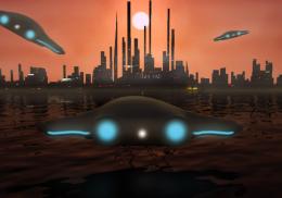 by layerstack 5720 views - final score: 60.4% | mastercard  by igogolf 4722 views - final score: 58.9% |
Ooopss!!  by chookobot 10028 views - final score: 58.8% | smoke bird 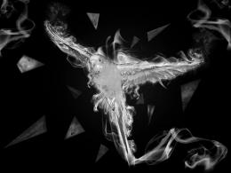 by Se7eN0f9 9315 views - final score: 58.1% | Raspberry Jewel Pluot Heart 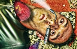 by Drivenslush 8060 views - final score: 57.2% |
pegasus painting 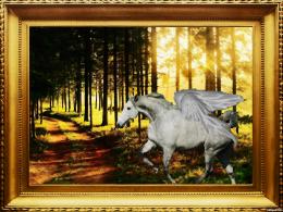 by CrystleClear 7987 views - final score: 56.6% | renew 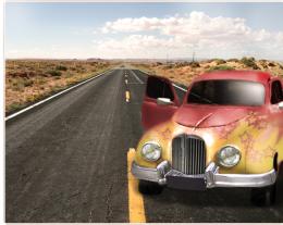 by basem11361 3979 views - final score: 55.7% | Kids Draw :) 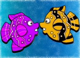 by weso 8184 views - final score: 55.6% |
Howdie Guest!
You need to be logged in to rate this entry and participate in the contests!
LOGIN HERE or REGISTER FOR FREE
my kind of entry...looking good!
Many thanks
Cool idea. I like the non-traditional use of orange, but the sky seems kind of blah and in need of more-dramatic saturation. Compositionally, the centering of the sun, city, and foreground UFO is also kind of blah. (I'd move the sun left and the front UFO right for a diagonal composition—which would require a sun reflection in the water since the UFO shadow would no longer block it.) The identical blurring of the lights of each of the UFOs regardless of their distance from the viewer/photographer weakens their impact IMO.
Thank you very much for your views on this DanLundberg I will take all your advice onboard
good concept..!!
nice work like it..gl author
Howdie stranger!
If you want to rate this picture or participate in this contest, just:
LOGIN HERE or REGISTER FOR FREE