
(5 years and 3259 days ago)
2 Sources:
Living colour  by kushpatel 10463 views - final score: 65.8% | Kiss  by marifre 10702 views - final score: 64.5% | The Beatles  by marifre 11273 views - final score: 63.2% |
Spice girls  by marifre 9273 views - final score: 63% | Pink Floyd 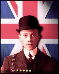 by lchappell 9288 views - final score: 62.6% | Bassnectar 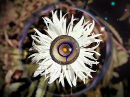 by bddesign 9624 views - final score: 62.6% |
Guns n' Roses 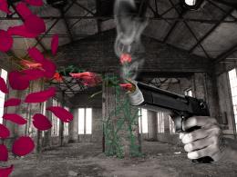 by fabter 13302 views - final score: 61.3% | The Lizard King  by freejay 6605 views - final score: 60.9% | My Chemical Romance  by artbybambi 7881 views - final score: 60.7% |
R.E.M. 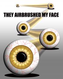 by Drivenslush 2857 views - final score: 60.2% | Simple Plan  by chookobot 8605 views - final score: 59.7% | Angelspit  by kekskruemel 5944 views - final score: 59.4% |
Jefferson Airplane/Starship  by artbybambi 9440 views - final score: 58.5% | Yellowcard  by chookobot 5283 views - final score: 58.1% | Radiohead 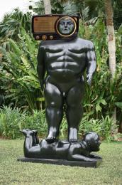 by Drivenslush 5014 views - final score: 57.2% |
Tesla/Edison 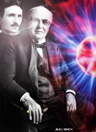 by woodztockr 7420 views - final score: 57% | Basshunter 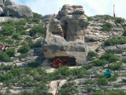 by kitysrblk 5848 views - final score: 56.7% | alien ant farm 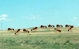 by artbybambi 6446 views - final score: 56.2% |
Green Day  by kitysrblk 5533 views - final score: 46.1% |
Howdie Guest!
You need to be logged in to rate this entry and participate in the contests!
LOGIN HERE or REGISTER FOR FREE
I'm not sure using a sculpture's head instead of a real human head really captures the band name, especially when the sculpture has a lot of distracting elements. That said, I would note that the radio casts a much weaker shadow than his pecs and that the radio is parallel to the image's plane even though the sculpture is angled away.
The shadow of the right foot is closer to the a$$ of the base character thus a darker shadow, the radio is farther away from the neck of the sculpture thus a lighter shadow (the pecs aren't really casting any viable shadow)
It's okay Dan, maybe if you actually entered some contests I'd actually know what you are talking about, but without any type of portfolio to cross reference I really have no idea what you are getting at. (you have a tendency to wonder and you lose focus quite quickly)
HEY! I know, why don't you enter some contests and show us how it's done, I mean, that would be a big help!!!
(Talking Heads)
Baby your mind is a radio
Got a receiver inside my head
Baby I'm tuned to your wavelength
Lemme tell you what it says:
Now you and I have no secrets
Now baby, lemme read your mind
I hear ev'rything you're thinking
You can't help the way you sound
I guessed the band as soon as I saw the image. Dan you said "I'm not sure using a sculpture's head instead of a real human head really captures the band name..." Maybe you should mention that to the author of this Radiohead album cover http://www.shutterphoto.net/article/100-best-photo-album-covers/ strange that it's actually listed as one of the top 100 album covers. "Distracting elements"? I'd say interesting elements. The pecs don't cast a shadow that's the reflection of the surrounding landscape. The radio appears to be canted forward a bit on the statues head, nothing wrong about that. I think this work shows most interesting creativity, nicely done author.
good work gl
radiohead has a smaaal weeeneee ha - ha - ha - ha - haaa - ha .
good chop
Do you remember when the only radio was AM...not stereo either. I was a "Radio Head" still am as a matter of fact. Shadows are fine.
Howdie stranger!
If you want to rate this picture or participate in this contest, just:
LOGIN HERE or REGISTER FOR FREE