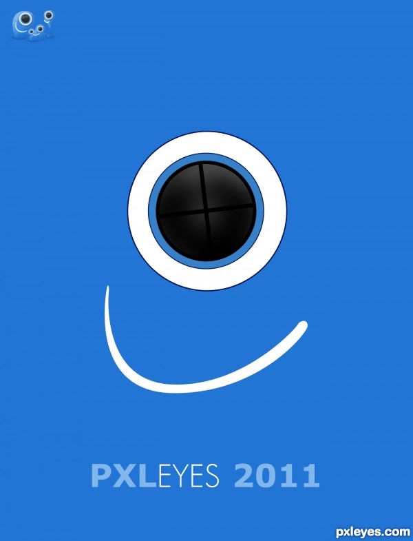
I was inspired by designer & artist Per Arnoldi.
Arnoldi is very well known for his posters and book covers.
His style is simple and just playing with colors and thickness of the text, is a typical characteristic of his style. (5 years and 3252 days ago)
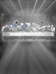
- 1: PXLeyes Logo







As a poster it looks pretty nice, but not sure how this would work as cover. The name The Eye will be also big on top of the image, so it would be double. Perhaps instead of THE EYE 3 you can write something else that's typical for Arnoldi? Also, would be nice if you could describe what you took from his work or style that made you create your design.
Good luck!
In fact, Arnoldi is very well known for his posters and book covers, so no wonder if it looks like a poster.


His style is simple and just playing with colors and thickness of the text, is a typical characteristic of his style.
Of course, my picture is far from commensurate with his works, for I am not Per Arnoldi. For then I'd be stinking rich.
I've now changed the text.
Thank You
Nicely done!
Good luck!
Howdie stranger!
If you want to rate this picture or participate in this contest, just:
LOGIN HERE or REGISTER FOR FREE