(5 years and 3230 days ago)
A Growing Day  by Drivenslush 9809 views - final score: 69.1% | A Roosting Place for the Night  by artgirl1935 7773 views - final score: 67.1% | wait for me...  by Androla 13438 views - final score: 62.8% |
The Many Finger Virus  by Drivenslush 11740 views - final score: 60.5% | New Temple  by Titan85 10322 views - final score: 57.1% | The Downpour 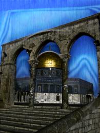 by tytylion 3636 views - final score: 56.4% |
This dude is Lost!  by woodztockr 7965 views - final score: 55.7% |
Howdie Guest!
You need to be logged in to rate this entry and participate in the contests!
LOGIN HERE or REGISTER FOR FREE
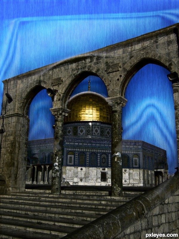
It doesn't look like rain, so much as a noise texture with a motion blur...Almost like a blue curtain.
Part of this is due to the background color (rain doesn't usually have such a blue environment), and the whitish shapes, in addition to the "too regular" noise.
Perhaps you could lightly erase parts of the "rain" at a reduced opacity with one of the "speckle" brush shapes to make the downpour look a bit more random.
Although the bevel and emboss (and the triangle) in the sky above the arches doesn't really make sense to me, I do like the design between the arches - it adds a touch of eeriness to the nicely desaturated temple and rain effect.
Howdie stranger!
If you want to rate this picture or participate in this contest, just:
LOGIN HERE or REGISTER FOR FREE