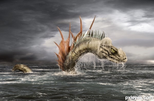
I had something little different on my mind for this, but since there is no more time for enhancements ......well everything is just blending those parts and splashes are drawn with simple round brush, on separate layer with spacing(95%) , scatter(260%), and then just bevel/emboss on that layer.
Credits to:
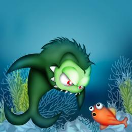
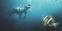
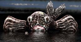
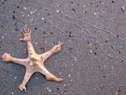
xNickixstockx from DA for fish image
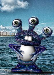
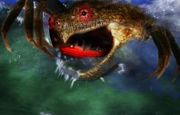
doc_ from sxc.hu for eye image
Mourge-stawk from DA for sky image
MQTRF from PXLEYES for
sea image
(5 years and 3234 days ago)
- 1: eye from:
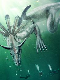
- 2: head from:
- 3: body from horn:
- 4: dorsal fin from:
- 5: pelvic fins from:
- 6: sky :
- 7: sea:

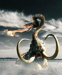
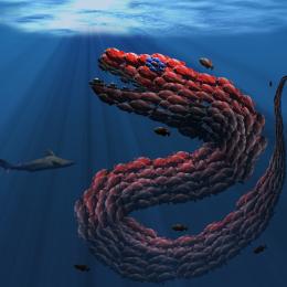
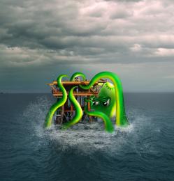
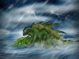
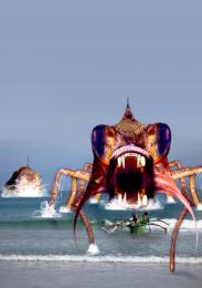
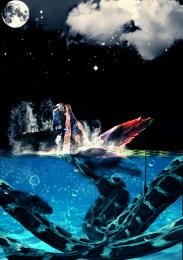


Looks good in Low-res, it's the most realistic image in this competition. I just 2 suggestions for you: (1) when you make the water splash, you can refer to the real one in the source that you used. The splash on the sea is blurred, not as clear as the one you made. From that distance, we almost can't see that splashes. (2) the composition: actually lower halve of the image has nothing to do, there is no information there. If the tail of the monster is seen on the bottom left of the image and you crop more tightly (the right side), your composition will be better.
Good luck, author!
Looks good, and has an awesome BG source/mood. That tail is a bit strange, but you ran out of time, so it's understandable.
excellent work author............ definately my favourite in this contest I love the colours throughout the pic, its blended really well.

Definitely a winner! Composition and mood are both perfect
Congratulations! Great entry
congrats pal
Congrats
Congrats awesome work
Thank you ALL for votes, comments and faves !!!
Congrats on first Place Win
Howdie stranger!
If you want to rate this picture or participate in this contest, just:
LOGIN HERE or REGISTER FOR FREE