(5 years and 3237 days ago)
The illusion of freedom  by Akassa 13019 views - final score: 65.1% | last experiment  by kushpatel 9880 views - final score: 60.8% | fresh magic  by zambrottix 10199 views - final score: 60.6% |
Let there be Lighting on Rod 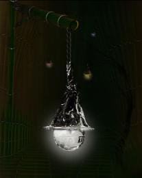 by nilknarfsoive 12677 views - final score: 60.6% | material girl 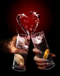 by hymerion 14932 views - final score: 60.1% | Time is running out 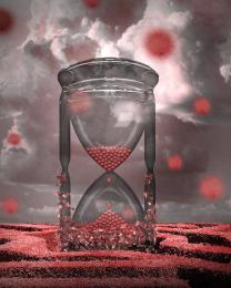 by kushpatel 6385 views - final score: 60.1% |
martini beach 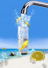 by andi 7536 views - final score: 59.9% | Turtle with Zoom 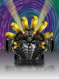 by Drivenslush 5713 views - final score: 58.6% | Martini Tower 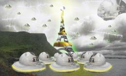 by jonel2k4 8113 views - final score: 58.2% |
All My Worries Die 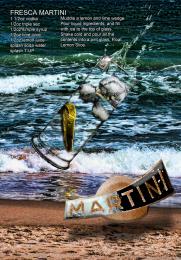 by Drivenslush 5507 views - final score: 57.9% | thirst  by guymlech 4351 views - final score: 57.6% | colorful balls 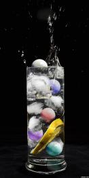 by wooyuenfoo 4752 views - final score: 57.5% |
Sunset games 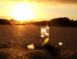 by AngeldustUK 7406 views - final score: 57.5% | Filled with Life 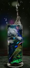 by nilknarfsoive 9086 views - final score: 56.5% | Love on the rocks 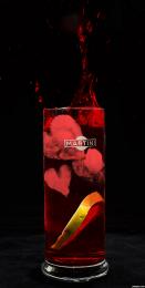 by artbybambi 4853 views - final score: 56.4% |
genesis  by kekskruemel 4066 views - final score: 55.8% |
Howdie Guest!
You need to be logged in to rate this entry and participate in the contests!
LOGIN HERE or REGISTER FOR FREE
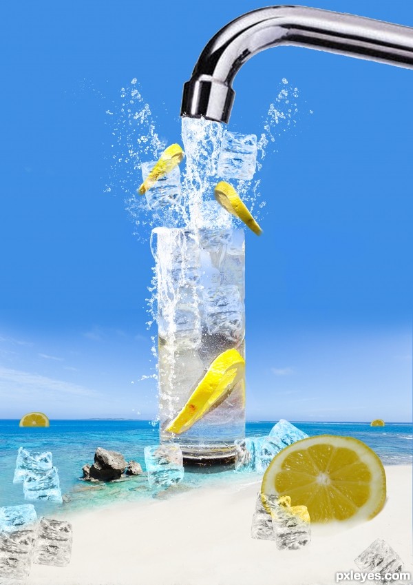
Refreshing, but that's not a martini glass and why is the foreground lemon shadowed instead of casting a shadow?
the color of the liquid in the glass doesn't show any of the blue behind it. The extra lemon slices look shadowed. The ice blue ice cubes in the water are the wrong blue. The glass doesn't sit in the water deep enough, it looks like it's on top of the water.
im sorry danlundburg am i in the wrong contest ???? i make this for the martini glass contest why is that ??? maybe for the name of this contest ????. is it martini glass ????,, JACKTIRED im goin to work on the glass color the lemon look shadowed maybe becose i use level to adjust maybe to much,, the ice cubes are in luminosity thats the color i get i dont think the glass is in deep water standing there but thanks im going to work on it when i have a chance,, thanks
biggest minus - shadowed lemon... there should be a lighting on the lemon, not a shadow...
thanks for the big minus scorpas realy help hahhahha
interesting refreshing image...nice colors and some cool effects...GL author
This is a nice entry! Fixing some minor issues would further improve it:
1. That metal pipe ( whatever is called ) must be cut out with pen tool in order to avoid chunky shape. Afterwards Ctrl click layer go to Select -modify , contract 2 pixels, invert selection and blur it. Same for the lemon slice in foreground.
Maybe overlaying the sky color on it at a lower oppacity would increase the blending.
2. Use blur and slight desaturation for the lemons in the background to create a better sense of depth.
thanks grey
Howdie stranger!
If you want to rate this picture or participate in this contest, just:
LOGIN HERE or REGISTER FOR FREE