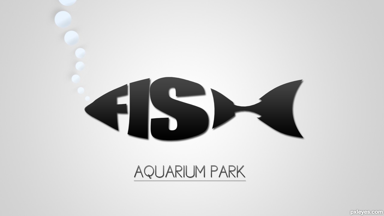
So, When i first saw this comp, i thought right on to the logos where the text forms a animal or a object. And i thought, which animal would fit for that? And a FISH was a perfect animal to do it with, so i did. (5 years and 3231 days ago)
Forever Frogs  by artbybambi 14451 views - final score: 66.4% | hummingbird  by spygirl1978 14900 views - final score: 64.7% | Colour by Nature  by PhotoRepair 16690 views - final score: 64.5% |
Fish Aquarium Park 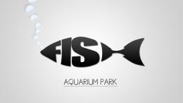 by li3N 18295 views - final score: 64.4% | tribal elephant god  by spygirl1978 18317 views - final score: 64.1% | Underwater Adventure  by George55 6537 views - final score: 63.9% |
Re-bate  by artbybambi 5768 views - final score: 62.3% | Sea Turtle Exhibit 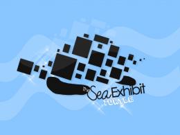 by CrystleClear 11672 views - final score: 61.8% | Falcon Academy  by lchappell 5936 views - final score: 61.2% |
Nature Sounds 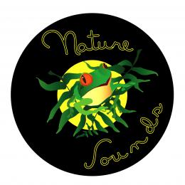 by ImmerVerloren 6917 views - final score: 60.6% | Gir-Have A Nice Day Tie Co. 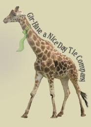 by alyssadanielle 10381 views - final score: 60% | Mouse Hunter  by nilknarfsoive 6264 views - final score: 59.9% |
Kiss the Frog 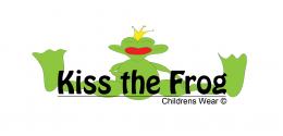 by Nysoe 9552 views - final score: 59.8% | ...the Visual World 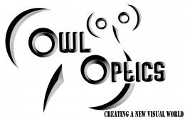 by Drivenslush 5424 views - final score: 59.6% | Rainforest Rescue 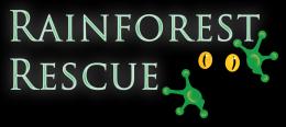 by PhotoRepair 6615 views - final score: 59.6% |
Ant Railways Welcome you ! 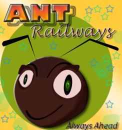 by Greatpapa 11490 views - final score: 59.5% | Penguin Records  by PSA2009 6352 views - final score: 59.3% | Blue Bird Wedding Chapel  by George55 7433 views - final score: 59% |
Grouping  by Drivenslush 4540 views - final score: 58.4% | N. Bull Breeding Association  by fabter 8354 views - final score: 58.1% | In a while crocodile!  by happyme27 10135 views - final score: 54.2% |
Howdie Guest!
You need to be logged in to rate this entry and participate in the contests!
LOGIN HERE or REGISTER FOR FREE
Photography and photoshop contests
We are a community of people with
a passion for photography, graphics and art in general.
Every day new photoshop
and photography contests are posted to compete in. We also have one weekly drawing contest
and one weekly 3D contest!
Participation is 100% free!
Just
register and get
started!
Good luck!
© 2015 Pxleyes.com. All rights reserved.


Very cool!
Wow
this is cool man ... i mean this logo worth a lot
Simple and Clean
I like the simplicity. The lack of color is kind of blah, however, which doesn't really entice me to visit the park. I also think "AQUARIUM PARK" should be a bit more prominent and I might consider adjusting its kerning to make that text as wide as the fish above it.
http://www.bananadesign.co.uk/work/branding/little-black-fish-films-logo

it's right???................sorry!
Wow, I've never seen that before?! I never used any picture as inspiration, and i also did ALL by myself. I'm surprised that someone else did it too, but i promise, i never seen that one before.
I realize the link does look similar to the authors entry. In Art School we had a class in lettering design (hand lettering). Using words and letters to create shapes which we called cartouches and one assignment was to create shapes to match the words. Fish was one of the easiest to do and at least a third of the class did virtually the same design (the word Love in the shape of a heart was done six times).
I think the one you have done author looks better than the example presented above. looking good.
I agree there with Chapp. Although there are similarities, No comparison imo. This is a good presentation. Good luck Author.
good luck!
simple, and very well done!!
Howdie stranger!
If you want to rate this picture or participate in this contest, just:
LOGIN HERE or REGISTER FOR FREE