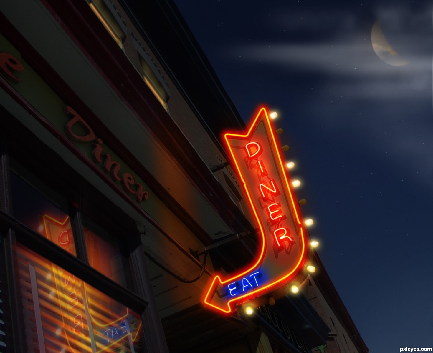
Made edits to moon as many have suggested. (5 years and 3218 days ago)
1 Source:
Diner at Night  by pixelkid 10745 views - final score: 68.9% | Childhood Magic 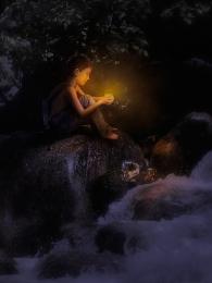 by arca 21635 views - final score: 67.8% | Fair Night 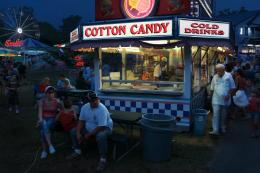 by Chalty669 13809 views - final score: 67.6% |
The Park: Day Into Night 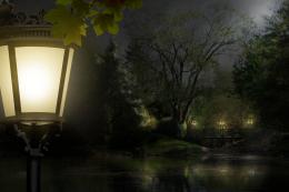 by elemare 13294 views - final score: 67% | any street 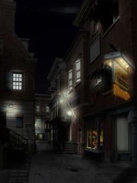 by zambrottix 11252 views - final score: 66.3% | lost 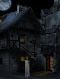 by Se7eN0f9 6049 views - final score: 62.8% |
Family night  by chakra1985 5699 views - final score: 61.3% | Last Journey Begins  by lchappell 6331 views - final score: 59.2% | Tree of life at night 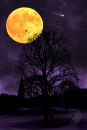 by Scarecrow73 12159 views - final score: 58.9% |
nameless  by basem11361 3371 views - final score: 58.1% | night silouhette  by spygirl1978 4067 views - final score: 57% | Mountain Road  by happyme27 7991 views - final score: 54.2% |
Howdie Guest!
You need to be logged in to rate this entry and participate in the contests!
LOGIN HERE or REGISTER FOR FREE
Photography and photoshop contests
We are a community of people with
a passion for photography, graphics and art in general.
Every day new photoshop
and photography contests are posted to compete in. We also have one weekly drawing contest
and one weekly 3D contest!
Participation is 100% free!
Just
register and get
started!
Good luck!
© 2015 Pxleyes.com. All rights reserved.


I like neon signs. GL.
Great work ... reflection is perfect and the lighting excellent ... not sure if I like the moon but that may just be a personal preference ... definite fav for me!
LOL! Thought so.... I've said it before. I really like your style author. If I could be anyone else in pxleyes world it would be you. Good luck!
very well done!
Absolutely well done, I do agree with arca on this one though, I'd dull the moon just a little.
I thought it was you...great job!!
This is terrific! And the SBS is wonderful. Not keen on the moon either, but I like the clouds.
Edit: Moon is much better - great job!
Terrific indeed. The burnt-out bulbs are a nice touch.
I'm afraid I have to give my allegiance to the 'less moon' crowd, however. The moon distracts rather than adds IMO. A just-out-of-frame moon could still illuminate the clouds elemare likes (although I would soften them a tad).
The reflection of the sign in the window is nice except a reflection needs to be the same distance from the reflective surface as the original is — so the reflection is much too close to the window pane. A little bit of the arrowhead would be reflected at best.
great job and exelent SBS!
Thanks for the suggestions everyone...made edits. I think it looks better too. @DanLundberg... I literally placed the new reflection right on top of the one that was originally there. Thanks for your input though...
Perfectly done and very convincing work!
Yep, like the edits... looking awesome!
Was great before ...now it is even better (if that is possible)!
Good work, author!
Top entry...and u become master in this day to night, lightening things author...well done
Excellent work!!
Great work author author ...best of luck!!!
Congratulations ... well deserved!
Congrats Kiddo, fabulous work, looks very realistic
Congratulation on your 1st place!
Congratulation Great work
Congrats!!
congrats
Howdie stranger!
If you want to rate this picture or participate in this contest, just:
LOGIN HERE or REGISTER FOR FREE