
(5 years and 3217 days ago)
Iron cow 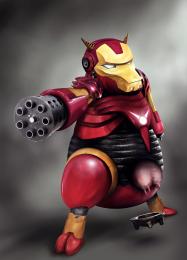 by langstrum 20857 views - final score: 73% | Futility of Individual Effort 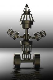 by Drivenslush 11648 views - final score: 69.3% | Galaxy Ruler 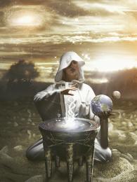 by jaskier 11949 views - final score: 67.1% |
Macabre Ritual 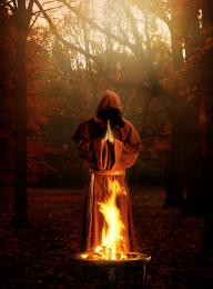 by DanielaOwergoor 16142 views - final score: 66.5% | The Well of Transmogrification 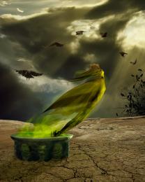 by arca 22874 views - final score: 66.2% | The Creature 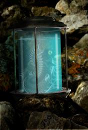 by George55 5118 views - final score: 66.1% |
Magalohr ride 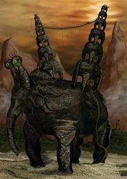 by SOLARIS 6222 views - final score: 65.3% | thirsty crows 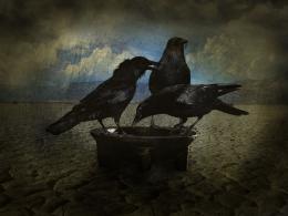 by niks1351 12780 views - final score: 64.4% | in my dreams 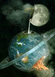 by macarhign 12178 views - final score: 64.2% |
The sweetest sound... 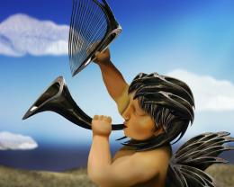 by loopyluv 6366 views - final score: 64% | Tesla Coil 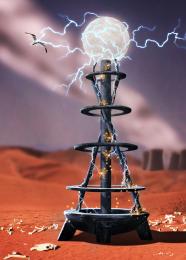 by greymval 18360 views - final score: 63.8% | Jewelry 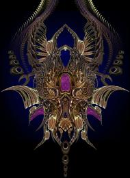 by SOLARIS 6136 views - final score: 63% |
ghost ship 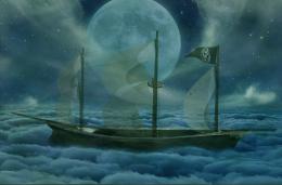 by macarhign 7343 views - final score: 62% | UFO 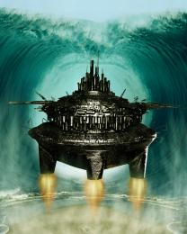 by macarhign 6228 views - final score: 61.5% | Wormy Munchies 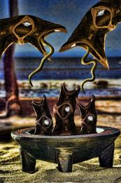 by Drivenslush 6022 views - final score: 60.6% |
serpents garden 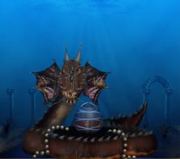 by scratzilla1 5391 views - final score: 60.4% | Indubitably 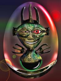 by Drivenslush 4944 views - final score: 59.8% | Kavia Cloning 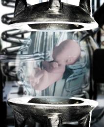 by PSA2009 8337 views - final score: 59% |
Rite of the Dragon 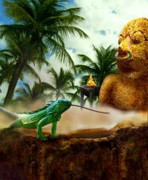 by artgirl1935 4672 views - final score: 59% | Spell to Get Out 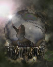 by nilknarfsoive 9650 views - final score: 58.9% | Kavia Kawaii Kreature 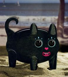 by MossyB 6511 views - final score: 58.8% |
Vessels Of Eternity 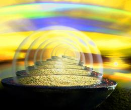 by lchappell 6074 views - final score: 56.8% |
Howdie Guest!
You need to be logged in to rate this entry and participate in the contests!
LOGIN HERE or REGISTER FOR FREE
Nice job with the extraction of source1 and the creation of the background. I think the flames could use more attention. Perhaps some more contrast on them, they seem a bit soft. Good luck!
Well constructed, but I don't get the water background...UFO parts the Red Sea?
its not in the red sea, somewhere in the ocean UFO hide. LOL
Author, your flames were made in the wrong way. Just remember images like this one http://www.deviantart.com/download/106640611/The_Flame_by_AuTuMn_Lee.jpg
Normally, the fire is brighter close to the source of the fire where the heat is maximum. So, from the center, the order of colors should be white --> yellow --> red. Sometimes you see the blue colors, it means something was burned more efficient, so more heat is released (more than white fire).
Hope that this helps and good luck with the contest!
EDIT: Yes, at least it's correct now!
(Fire) fixed
thanks to you langstrum
It's great that you fixed it author, and nice idea with those waves. It might not make sense for some, but it works compositionally and it's pretty original!
 . ( it's the yellow hand at the right of the comment section- click on it).
Btw, you should thumb up Langstrum for taking the time to help you, he deserves that much
Good luck.
wow! complex... suggest the lower part of the UFO to be much smaller
Very creative, love it
Howdie stranger!
If you want to rate this picture or participate in this contest, just:
LOGIN HERE or REGISTER FOR FREE