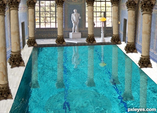
(5 years and 3215 days ago)
3 Sources:
- 1: clear water
- 2: background
- 3: column
Vaudeville Puppy  by Drivenslush 10720 views - final score: 64% | holy mary miracle cave  by jack2 18317 views - final score: 63.3% | claimed by the sea  by scratzilla1 9438 views - final score: 63.2% |
The Hunter  by nasirkhan 7629 views - final score: 62.4% | Dream catcher  by scratzilla1 9689 views - final score: 61.9% | Poolside At Dusk 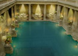 by elemare 6591 views - final score: 61.3% |
pirates ship living place 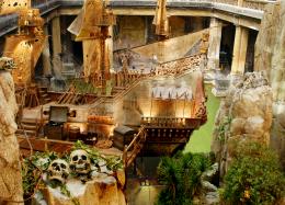 by wooyuenfoo 7876 views - final score: 58.6% | old pool in the forest 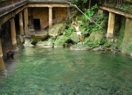 by adelia 10880 views - final score: 58.5% | Pool Party 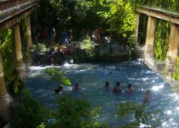 by Dairon16 6587 views - final score: 58.4% |
Well of light 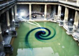 by lbadge320 7677 views - final score: 58.2% | renovated pool 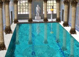 by lano4ka 6162 views - final score: 56.4% | Old Pool 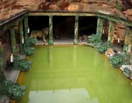 by Mienkie 6393 views - final score: 56.1% |
pool 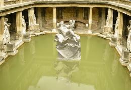 by ramesan 4029 views - final score: 55.4% | Storm in a Pool 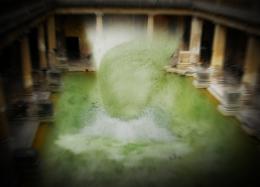 by trevordsouza7 5112 views - final score: 53.5% | my old pool of 20 century 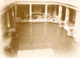 by casper76bg1206 6356 views - final score: 49.1% |
Howdie Guest!
You need to be logged in to rate this entry and participate in the contests!
LOGIN HERE or REGISTER FOR FREE
The filter used on the columns is very fake looking, because it is too flat and does not change in perspective as it recedes into the horizon line.
Also, the pool you used is at a different angle than the contest source, which makes the lines look extremely crooked, and the pool then appears to be tilting.
The statue is too large in proportion to the pool, and the lighting is not consistent with the rest of the image.
This is a really good concept, but it looks very rushed, without enough attention to detail...
Well commented MossyB. This is a good entry Author. However, i agree with MossyB. Please take the feedback as a way to improve and advance your entry and artistic skills.
I hope that you get the time to make adjustments to your entry.
Thank you for comments i did some adjustments and waiting for new comments.
Love the changes.. If you look at the base of your NEW coloms you will see that they do not connect to your floor. To fix this add shadowing.
:look where your light comes from, use your BURN tool to add shadow. IF you want more information on how to do this Message me.
GOOD LUCK .
Shadow added.Thank you !
The 4 back columns look like they are hanging over the pools edge.... I would just make them a bit smaller, it will also had depth to the image
Howdie stranger!
If you want to rate this picture or participate in this contest, just:
LOGIN HERE or REGISTER FOR FREE