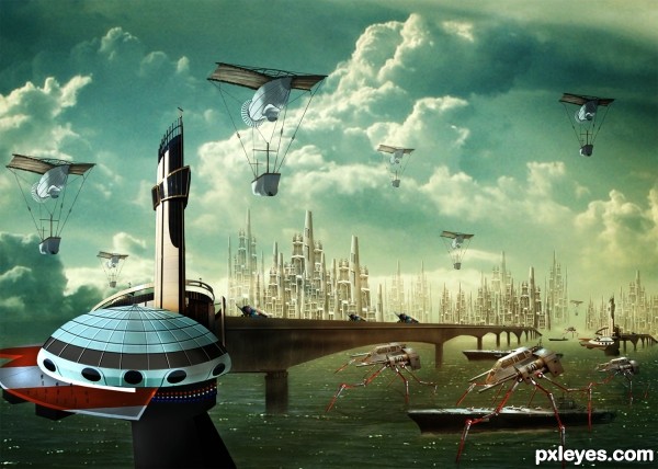
(5 years and 3208 days ago)
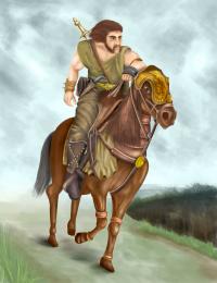
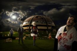
8 Sources:
- 1: source1
- 2: source2
- 3: thanks peace of art
- 4: thanks Fantasystock
- 5: source5
- 6: source6
- 7: thanks Chainbound
- 8: source8



You should work a little on the shadows to create a more realistic effect, nice concept.
The round shape on the LH side looks tilted downwards to the right. Is it a stationary building (with people on the edges), or is it a flying saucer?

You also have very inconsistent light sources all over the place, with the sky and flying machines illuminated from the opposite side of the saucer, the background city, the ships (which are lit from above), and the skyscraper, which is lit from the RH middle.
The ant-type creatures on the water, as well as the bridge, show no shading at all on the water, and the reds are too warm in tone for the overall blue cast you have given this image.
It's a very interesting concept, but it is very inconsistent in execution and needs a lot of adjustments to be visually believable.
thanks,....I will do some ajustments. yeah the shadow and the lightning needs more efforts.
EDIT : some changes were done,...hope is better now
Very nice! I like it!
Do you have a sbs on the things you did to improve this, I do like it better but inquiring minds want to know your secrets.
Congrats, terrific improvements
a lot is going around in this picture! and that is why is so good! Congrats!
Congrats..... its very nice
Congratulation, my friend!
Howdie stranger!
If you want to rate this picture or participate in this contest, just:
LOGIN HERE or REGISTER FOR FREE