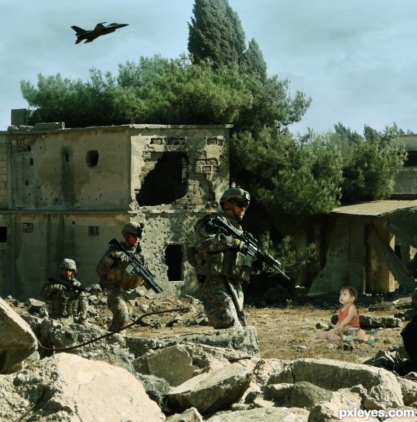
Baby's in a wrong place...
Thank you to Redvisualg at sxc for the lovely baby photo:
http://www.sxc.hu/photo/1023719 (5 years and 3201 days ago)
5 Sources:
Underground  by ponti55 16189 views - final score: 66.4% | Sea cactus  by nasirkhan 13450 views - final score: 63.6% | THE DREAMER  by lolu 8357 views - final score: 61.3% |
Owl eye 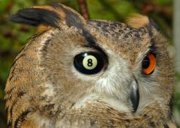 by CMYK46 15554 views - final score: 61% | Lost Camel 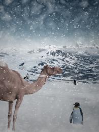 by theodosiou 18138 views - final score: 60.8% | Toilet of La Mancha 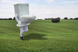 by Drivenslush 7237 views - final score: 59.8% |
Arizona Walrus 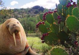 by RickLaMesa 5905 views - final score: 59.5% | Mojave Penguins  by RickLaMesa 6033 views - final score: 59.4% | Footbaaaaall 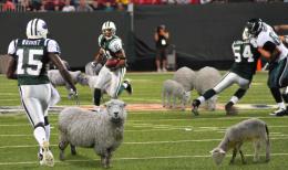 by minnie 3517 views - final score: 59.3% |
Home again 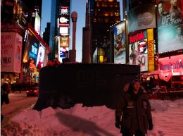 by filantrop 4750 views - final score: 58.1% | The Apple 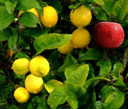 by jordyponce 5081 views - final score: 57.9% | Hors d'oeuvre 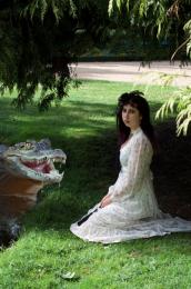 by CMYK46 4471 views - final score: 57.8% |
2 different flowers 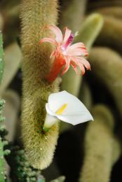 by wooyuenfoo 4607 views - final score: 57.3% | KL tower too near to KLCC 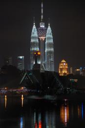 by wooyuenfoo 11107 views - final score: 57.3% | wrong growth 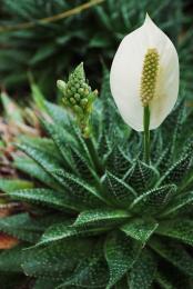 by wooyuenfoo 4401 views - final score: 57% |
why? why not!  by thegrafixgirl 9141 views - final score: 56.9% | Kitten in Floor (or DORAEMON) 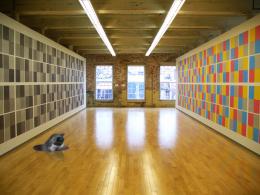 by Drivenslush 10659 views - final score: 56.5% | Wrong 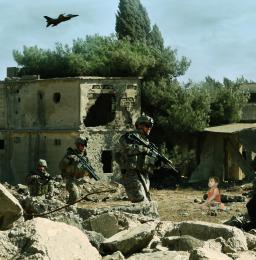 by minnie 4137 views - final score: 55.7% |
Fungus Faux Pas  by Drivenslush 7675 views - final score: 54.8% | peace/hit  by thegrafixgirl 6701 views - final score: 54.3% | square peg in a round hole  by thegrafixgirl 12595 views - final score: 53% |
Howdie Guest!
You need to be logged in to rate this entry and participate in the contests!
LOGIN HERE or REGISTER FOR FREE
Hi there, I thought the baby's too bright. =D
My suggestions, you could try to reduce the tone of the baby with a little levels adjustments or curves or exposures. And try to color balancing the whole part of your scene with Photo Filters or just play with the channels.
Good luck! Poor baby! Lol!
Hi Hayato!! Thanks for your tips, I've just post the SBS and there you can see I've already used curves and vibrance and saturation... I just don't know how to do it!!

Anyway, I'll keep on playing with the values!!
Hi Author, I love how you trying to balance the images with the SBS provided. It's great with so many experiments already. Love it! But one distracting thing is the hand of the baby (right side of the image) looks so bright... or it's just my monitor screen??
Author, if you apply about 5% of Cooling Filter 82 (Image>Adjustments>Color Filter), you will help get the adjustment for the skin tones and clothing that you need - The baby is too warm toned for the image.
The baby is also too large for its position within the picture. The head is almost as large as the head of the soldier, but he is much closer to the viewer than the baby. If you scale the baby down by about 10% (Edit>Transform>Scale, type in 90% for height and width), you will bring it into better proportion for the image.
You may also want to sparingly use the Dodge tool on the top back of the baby's head to reflect the strong sunlight.
Hope this helps, it's a good concept!
@hayato, I know what you mean. And that highlight wasn't so bright before the curves adjustment layer. I'll try and fix it.

 ) I also redid the layer with the dodge, I made it too much the first time. Hope it is better; though here, at the web, it looks darker than in photoshop...
@mossyB thanks for the tips. I'll try them right now!!
Thanks for helping me guys!!
EDIT: Kid's smaller and tried photo filter (3%, 5 it was too much
It looks MUCH more realistic. Nice changes!
poor baby...
I love these kinda of pictures,uh finally sees what I like,,but It looks better without the baby haha..I know it's the main purpose of your work..but that's what i think..
Howdie stranger!
If you want to rate this picture or participate in this contest, just:
LOGIN HERE or REGISTER FOR FREE