created using clone, path, brush, and hue-saturation/brightness-contrast. (5 years and 3202 days ago)
1 Source:
- 1: source1
Biking downwards  by fredtrappenburg 12929 views - final score: 62.9% | Something to remember ...  by DanielaOwergoor 11068 views - final score: 62.2% | top of the hill  by ramesan 13075 views - final score: 62% |
Spring Sprinkles  by Chalty669 9873 views - final score: 61.2% | El portal  by noelle811 10354 views - final score: 61.1% | tweewieler  by evert 3788 views - final score: 60.3% |
Hungry snake 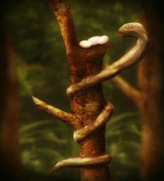 by nasirkhan 6449 views - final score: 60.3% | twin biker girl at farm 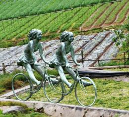 by wooyuenfoo 7609 views - final score: 59.2% | When the witch hates you... 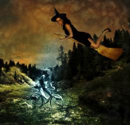 by theodosiou 9200 views - final score: 59.2% |
Tour de France 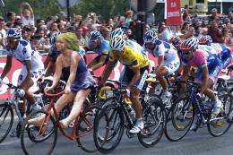 by Fredex 7658 views - final score: 59% | Last Night 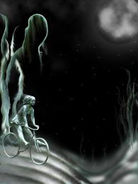 by nilknarfsoive 12939 views - final score: 58.7% | after a ride through the park  by dreddick 6526 views - final score: 58.7% |
Girl + biker girl 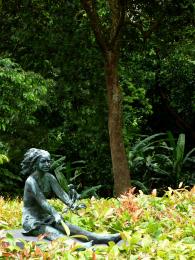 by wajdaz 6959 views - final score: 58.5% | a crow's perch  by dreddick 13377 views - final score: 57% | back to life  by maozbd 5156 views - final score: 56.5% |
Girl in moon  by ramsesje 6243 views - final score: 56.1% | Floating Stone  by peedurr 5952 views - final score: 54.3% | Color Splatter 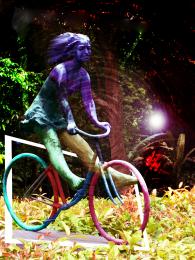 by Dairon16 5439 views - final score: 52.9% |
Shopping 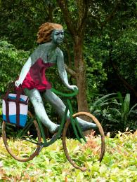 by vosya 4937 views - final score: 52.3% |
Howdie Guest!
You need to be logged in to rate this entry and participate in the contests!
LOGIN HERE or REGISTER FOR FREE
Photography and photoshop contests
We are a community of people with
a passion for photography, graphics and art in general.
Every day new photoshop
and photography contests are posted to compete in. We also have one weekly drawing contest
and one weekly 3D contest!
Participation is 100% free!
Just
register and get
started!
Good luck!
© 2015 Pxleyes.com. All rights reserved.


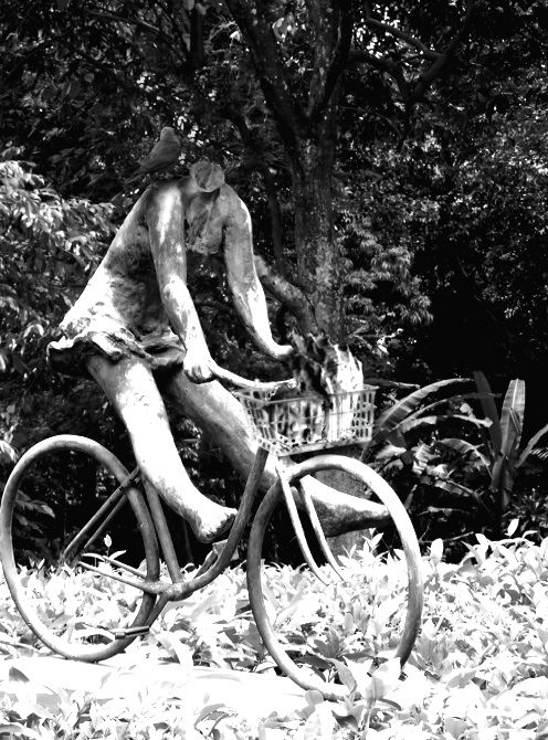
The basket is too sharp edged in comparison to the rounded edges of the rest of the sculpture.
By comparison, the "neck" of the sculpture where the head was removed is too soft and rounded, making it look lumpy and somewhat "melted." A bit sharper "break" edge would better convey the headlessness. You may also want to clone in some of the leaf pattern behind the neck to better blend the space with the background.
To get rid of the sharp edged basket, try to use a little bit Gaussian Blur. Or just use the Blur Tool. A little lighting to the "neck" should make an illusion to the headless stone. Btw, where's the so called Crow? It's too dark to see the crow standing by the "neck". Try to add a little highlights to the Crow's feathers that reflect the lights/sun rays.
Hope it helps. Awesome idea, Author.
Thanks for the tips!
The neck looks much better, but now you've increased the overall contrast too much, making the brights look "blown out" to almost pure white, which really makes the ground look bad, almost like a poor infra-red effect...
Also, although you've now softened the basket, it shows NO highlights to correspond to the rest of the statue. You may have to hand paint those in with either the Paintbrush, or the Dodge tool.
Perhaps you should add a bit of the green color of the foliage back into the image?
Howdie stranger!
If you want to rate this picture or participate in this contest, just:
LOGIN HERE or REGISTER FOR FREE