Thanks to NightFateStock (5 years and 3197 days ago)
4 Sources:
- 1: Balloon
- 2: Basket
- 3: Waterscape
- 4: Sky
Elfin kid  by freejay 34152 views - final score: 69.2% | Thumbelina Ride  by jaskier 10453 views - final score: 66.3% | one last look before bedtime  by yahidithmonnalisa 16851 views - final score: 64.9% |
Solitude  by nilknarfsoive 13989 views - final score: 63% | To see the world 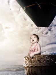 by ponti55 10566 views - final score: 62.8% | Hell spawn  by CMYK46 7794 views - final score: 61.3% |
Baby riding  by nasirkhan 5906 views - final score: 60.2% | What is that up there? 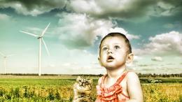 by jordyponce 6051 views - final score: 59.7% | angel 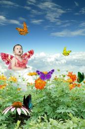 by ramesan 7055 views - final score: 58.8% |
Gucci Gucci Googly Gob 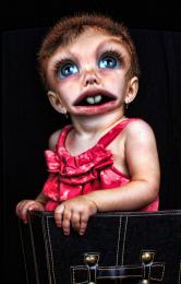 by Drivenslush 8333 views - final score: 58.7% | The Mating Call 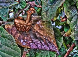 by Drivenslush 5226 views - final score: 57.9% | butterflies 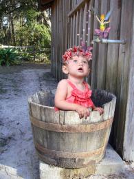 by demi 8517 views - final score: 57.8% |
Bubble Babes 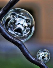 by Drivenslush 7036 views - final score: 57.5% | Bubbles 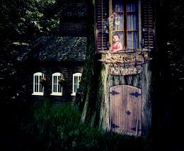 by noelle811 4468 views - final score: 55.7% | Surprise,surprise 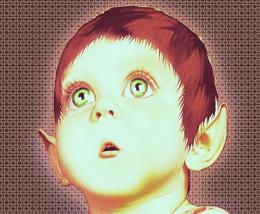 by noelle811 4577 views - final score: 55.7% |
waiting the light 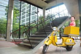 by wooyuenfoo 5513 views - final score: 55.4% | toy light  by wooyuenfoo 5591 views - final score: 53.6% | Wrong Order 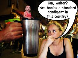 by GAYART 5076 views - final score: 52% |
Howdie Guest!
You need to be logged in to rate this entry and participate in the contests!
LOGIN HERE or REGISTER FOR FREE
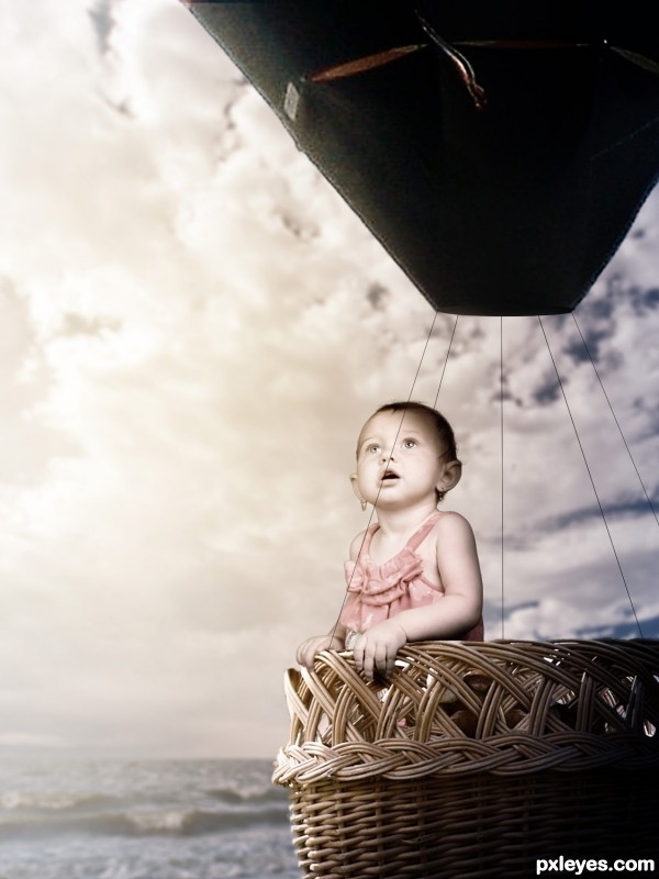
Ballon & basket are out of proportion. Too many white edges on child & balloon.
The white edges were done using the Glowing Edges filter set to screen, they were intentional. As for the proportion i'm very aware of it but it would've made for a boring image if they were.
Might have been easier to make a SBS explaining that, then...??
The lighting is too inconsistent and wonky, from the intentional glow edges, which just look like a bad extraction, to the totally black balloon, showing no light refraction/reflection from the strong light source of the sun.
The "shadows" from the totally black balloon lines also look very unrealistic, and not in a good fantasy way.
While an SBS would help the view recognize which poor chopping effects are deliberate, this is still an image that needs work, either to look more realistic, or more fantasy. At present, it just looks very novice, especially for a photoshop competition, IMHO.
Glowing edges overlay removed, black lines made thinner, more light added to the balloon and scaled down the child slightly. Thank you.
Maybe it's just me but the balloon feels a little low compared to the water... I can foresee an imminent and dramatic crash on the horizon...
Oh and on the subject of the balloon and basket being 'out of proportion' I think it probably looks better this way than if they were not scaled down to the baby. Now do feel free to ignore this if it becomes pretentious but a full size basket would give the idea that it was being seen by an adult and that the baby was out of place or intruding for comic effect. Whereas a smaller basket kind of gives the impression that it is being seen by the child, in its own world, and that the basket is specifically for it, not adults. I warned you it would become pretentious...
balloon color to change to match overall color scheme

strings not strong enough to hold balloon, change to ropes?
nice idea
Howdie stranger!
If you want to rate this picture or participate in this contest, just:
LOGIN HERE or REGISTER FOR FREE