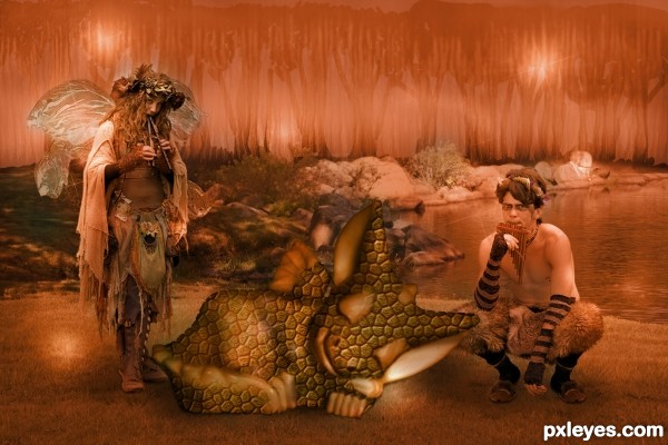
It is said that music soothes the savage beast... it apparently works on baby beasts, too.
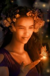
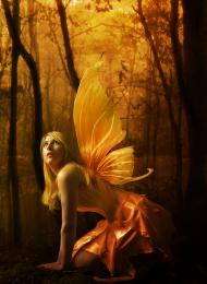
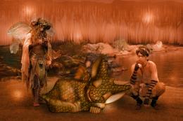
Thanks to atistatplay and Stock-Karr for the images. Background is my own image, and "trees" is from CGTextures. Scale texture is based on a tutorial (link included). Brushes from rL-brushes.
NOTE: atistatplay authorizes use of all images, no matter where they are posted (under "stock" or not): http://atistatplay.deviantart.com/
(5 years and 3265 days ago)


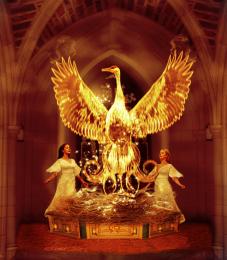





The sparkle brush on the fish is a wee bit over-dominant to the image, but the overall concept and execution is very well done!
should make the whole image more "saturated" color of orange, now more black than orange
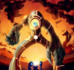
Interesting, but the central thing is too flat and indiscernable. Actually, I'm not sure why the central thing is necessary. (Delete the central thing and move the boy slightly in front of the girl.) Also, the trees in the background have as much depth as a painted flat in a high-school musical. So many flares is distracting IMO.
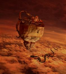
Thanks so much for the comments, everyone! The baby dragon was reworked - and hopefully is now better defined; the entire image was lightened to look more medium orange than dark orange, and the glow of the flares was muted.
(By the way, Dan, about the background, EXACTLY what I wanted!) : )
Very sweet! Background is very interesting, it kind of makes a secluded enclosure. The texture on the little dragon was done well, I like that you left some parts without it. Great job with extraction of the fairy and Pan, too.
LOL, RIPSAW. I was just reading your post in the forums.
Howdie stranger!
If you want to rate this picture or participate in this contest, just:
LOGIN HERE or REGISTER FOR FREE