
thanks and credits to NovStock,mizzd-stock,Fairiegoodmother,mjranum-stock,PirateLotus-Stock,CAStock,Moonchilde-Stock (5 years and 3172 days ago)
7 Sources:
In the Depths  by artgirl1935 6912 views - final score: 64.9% | Sea-king(seeking) a tea party  by scratzilla1 8883 views - final score: 63.3% | Hope  by Draco 10410 views - final score: 62% |
King of the seabed  by theodosiou 11940 views - final score: 60.5% | ghost house  by ramesan 8691 views - final score: 58.5% | King Arthur  by Dubhy63 4764 views - final score: 58.5% |
king of city  by wooyuenfoo 4755 views - final score: 57.7% | Big King Garden Fountain  by jordyponce 6906 views - final score: 57.5% | submerged sea king  by lbadge320 7358 views - final score: 56.7% |
We're gonna Koogalshnook!  by Drivenslush 4194 views - final score: 56.3% | King Of Pirates 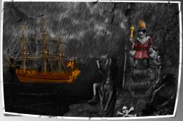 by sasikanth123 8051 views - final score: 56.2% |
Howdie Guest!
You need to be logged in to rate this entry and participate in the contests!
LOGIN HERE or REGISTER FOR FREE
This image is very inconsistent and poorly put together. The perspective and proportions of the skeleton are too stretched. The entire image looks like it is being projected onto a gauze curtain (is it supposed to be raining?) and the woman and lighthouse are totally out of place for the image - They are both lit from the left, while the skeleton in front is lit from above, the sea king is lit from the right top, and the ship is lit from the mid to lower right. The figure in the lower RH corner is backlit and almost impossible to clearly make out at all.
It's an interesting concept, but it needs a lot of clean up with more attention to detail.
Ouch, MossyB, really ouch... but agreed with the corrections. Esp the fire... I don't know how to describe, a little yellowish white of true fire would make those fires realistic.
Agreed with the interesting concept. Looks so glooomy though. Good luck~!
tried and changed the fire....@Hayato,MossyB's comment is made on the image which i changed entirely.........thanks for the suggestions guys. actualy iam new to photoshop and also new to pxlyse.
Hayato says:

"Ouch, MossyB, really ouch..."
That's exactly my sentiment! Since this is a competition, rather than a display website, entries need more attention to basics like lighting and composition and consistency...
Getting rid of the lighthouse and the stretched skeleton helped the composition a LOT, but the woman is still too brightly lit from the opposite side of your other main elements. Her leg could be a lighthouse by itself...
The rain looks much better, but the yellow smudgy strokes in the corners are distracting, and the totally desaturated image except for the king and the yellow smudges does not give the image an overall integrated feeling.
Better, though.
thanks MossyB, i have worked on it.....
Really better now! Good effort!
thumbs up to mossy... good luck author
all credits to mossy....
Howdie stranger!
If you want to rate this picture or participate in this contest, just:
LOGIN HERE or REGISTER FOR FREE