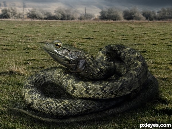
I hope I have understood the idea ...
Stocks:
Night fate-stock:
http://night-fate-stock.deviantart.com/
Nikkayla: http://nikkayla.deviantart.com/ (5 years and 3276 days ago)
The Parrosus 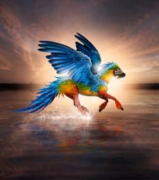 by Robart523 33679 views - final score: 74.4% | puggy  by elficho 19063 views - final score: 68.6% | MEOW 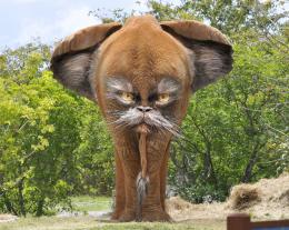 by Poss 17218 views - final score: 67.8% |
Girrake 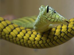 by Majkman 9122 views - final score: 65.8% | Snakefrog 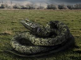 by DanielaOwergoor 10162 views - final score: 64.7% | Fly-Ostrich 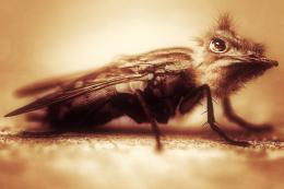 by jordyponce 5885 views - final score: 63.6% |
Crocofrog 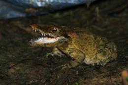 by Mikaelbg 9273 views - final score: 63.1% | lionbee 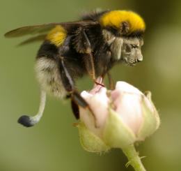 by hymerion 13069 views - final score: 62.7% | feathersfish 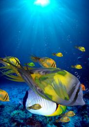 by andi 4873 views - final score: 61.5% |
guanawhale 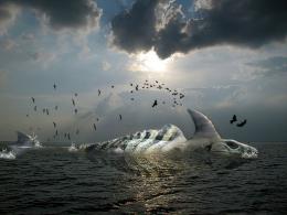 by andi 4720 views - final score: 61.2% | Sheepleon 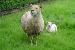 by aheman 6592 views - final score: 61.1% | Rhinofly 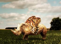 by theodosiou 12567 views - final score: 60.7% |
Meet The Mighty Turtledile 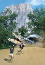 by yoguy108 9018 views - final score: 60.6% | woooowww 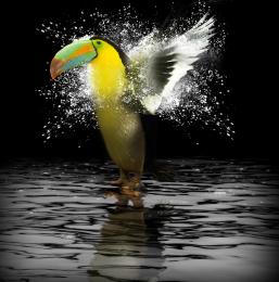 by andi 5421 views - final score: 59.9% | Hiptit 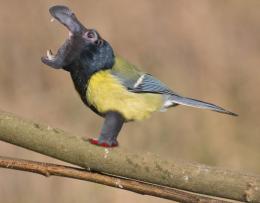 by filantrop 4758 views - final score: 59.9% |
Pokemon? 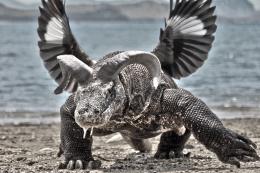 by Mikaelbg 7106 views - final score: 59.2% | That guy 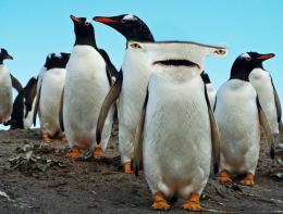 by Mikaelbg 6732 views - final score: 59.2% | elephant affair 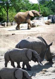 by jack2 6060 views - final score: 58.6% |
picuo 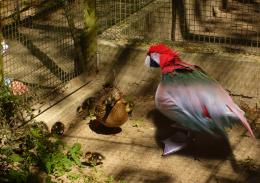 by jack2 4403 views - final score: 58.5% | Tiger mosquito 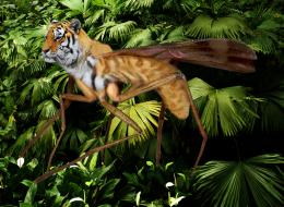 by minnie 12781 views - final score: 58.4% | nameless 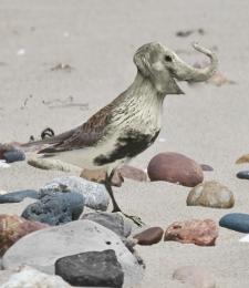 by aridewi 4217 views - final score: 58.3% |
The Fielding Grey 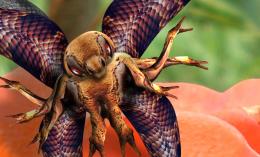 by Drivenslush 5962 views - final score: 57.7% | CatzeebraCrab 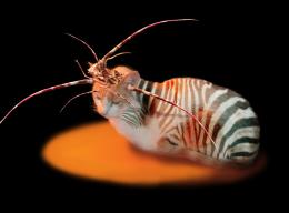 by marina08 3866 views - final score: 57.7% | Fuzzy Poops 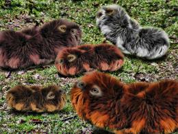 by Drivenslush 6155 views - final score: 57.5% |
Pensive Thinker 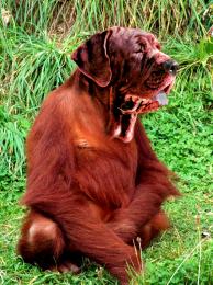 by junkieball 5918 views - final score: 57.1% | the new arrivals 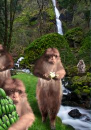 by jack2 6515 views - final score: 56.7% | mix 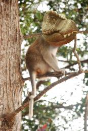 by wooyuenfoo 5093 views - final score: 54.9% |
Babysnakes 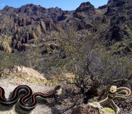 by Majkman 3839 views - final score: 53.2% |
Howdie Guest!
You need to be logged in to rate this entry and participate in the contests!
LOGIN HERE or REGISTER FOR FREE
Good blend, but the background hues are too close to your creature's...try to make it stand out more.
Really nice! Blending is very good; maybe you would like to add some orange or teal tint to the image just to create a mood, but that's just IMO Good luck anyway!
Thank you for the comments guys!
I arranged the BG, I gave it a certain distance ... Hope I have been good!
Author, I don't see any difference.
EDIT: Looks much better now IMO.
The frog-snake is too similar in tone to the grassy background. Perhaps a wee bit of a warming filter on the background to give it a hint of a color difference...
the frog-part is too sharp compared to the snake part, should be the same sharpness, then will it look a whole.

To make the picture more interesting, should let it coil-up a prey... etc. The background cannot bring out the creature as the main focus.
The legs, to me, is not necessary
I disagree with all of the above!
Great blending, great find of sources and great thinking about the colors. This would be a species that would benefit from having colors which blend in the surroundings. Good entry!
Guys, thank you for all the tips! So many that I even lost on what I should change.
So let's share:
MossyB & Lamantine: BG, I left in a lighter green than the creature.
Really everything was matched before, but I have not changed much, ok? Thanks!
CMYK: what I'd done before was to cut the top of the sky, sorry, I had not really changed the tone, I've forgot that. But now, yes! Thanks!
Aheman: the sharp decrease of the frog's head, I hope you can see the difference. But I decided to keep the little leg, I thought it would be a way to be different ... But thank you!
Rob: Thank you for approving the work the way it was, but at some points I had to agree with people above.
However, I hope that the changes have not been much disapproved by you, after all, are still consistent. Thank you!
Nifty!!! (and that's all I gots to say. hehehe)
i love it and find it very believable... but would have liked to see it on rocks... more the place you might expect to find a rough scale critter ilike this
It really does look like a new species, GL!
Howdie stranger!
If you want to rate this picture or participate in this contest, just:
LOGIN HERE or REGISTER FOR FREE