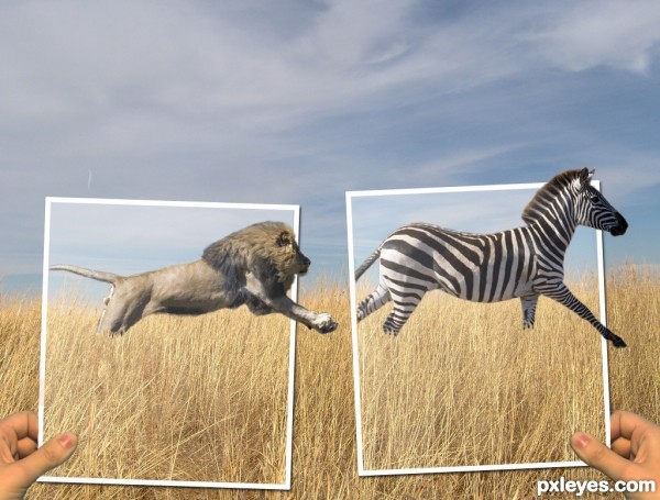
I wanted to do a picture with a lion and at first I wanted the zebra to be a person instead. But I couldn't find a good stock image of a person running away so the zebra is going to get eaten. (5 years and 3161 days ago)
4 Sources:
Hibernation  by yoguy108 12333 views - final score: 72% | The smell of life  by lordymail 13212 views - final score: 69.1% | imperfect  by yahidithmonnalisa 10954 views - final score: 68.1% |
Still Life  by elemare 8138 views - final score: 64.7% | Merde Bon Vin Français  by lchappell 9120 views - final score: 63.6% | balloon  by Se7eN0f9 4840 views - final score: 63.2% |
Washed Up  by CrAzYChelie 4697 views - final score: 62.5% | Bonsai Tree Goes Home With Me 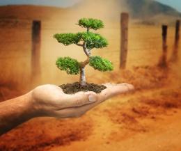 by jordyponce 7499 views - final score: 61.9% | it came from the abyss 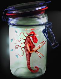 by yahidithmonnalisa 8450 views - final score: 61% |
tigerine avatar by jack2 7120 views - final score: 60.3% | On eye 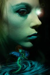 by Mario 3872 views - final score: 59.9% | The Chase 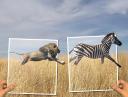 by angelaj 12448 views - final score: 59.5% |
Niño Grudge  by jordyponce 4914 views - final score: 58.9% | King of Animals  by theodosiou 11954 views - final score: 58% | Baby Alien  by jordyponce 5229 views - final score: 57.9% |
7th Day  by theodosiou 3951 views - final score: 57.4% |
Howdie Guest!
You need to be logged in to rate this entry and participate in the contests!
LOGIN HERE or REGISTER FOR FREE
This is a pretty good piece. I really like it. I do have a couple of suggestions though and will wait to vote. First, do a little research of the size of a lion relative to a zebra. Your picture seems like the lion is a bit large. If both are in the original then I will just accept that I know very little about lions and zebras Second, putting one of the frames in front of the lion might add a little more dimension. Finally, the exposure on the hands doesn't really match. Not sure how to fix it, just seems not quite right. Just some food for thought.
thanks for your suggestions. Instead of making the lion smaller I made the zebra a bit bigger. I moved both animals to the left and put the frames in front of their tails to make it seem more like they are in the pictures. And lightened up the hands to make them a bit more pale because the whole picture kind of just has a pale look to it.
i like the concept. maybe darken the background a bit, to draw attention to the photograph frames?
also, there are some sort of mask on top of the animals, is a little distracting.
I lowered the brightness of the background and it does help the foreground pop out a bit, thanks. and the mask that is over the photographs is suppose to be some gloss how pictures have, but I lowered the opacity of it over the animals.
Very cool image author...one of the best ideas for OOB image...u should fix some minor details such making edges of animals bit softer and maybe with smudge tool u could work on hairs and fur....also, this is OOB image but don't forget shadows...GL
Howdie stranger!
If you want to rate this picture or participate in this contest, just:
LOGIN HERE or REGISTER FOR FREE