(5 years and 3183 days ago)
9 Sources:
travel by foot-wear  by tk 11834 views - final score: 68.6% | my sweet home  by kushpatel 14246 views - final score: 67.9% | busy busy busy..  by tk 9146 views - final score: 67.4% |
Elven Hideaway 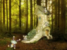 by elemare 13327 views - final score: 65.9% | Evening row 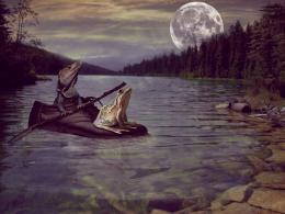 by minnie 11202 views - final score: 65.7% | ready to fight 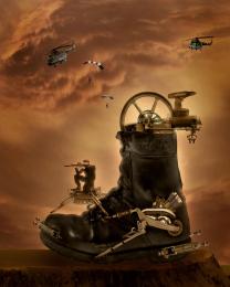 by kushpatel 5959 views - final score: 65.3% |
Home Sweet Home 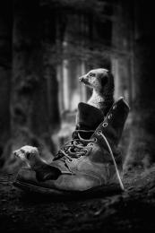 by jordyponce 7121 views - final score: 65.2% | Home 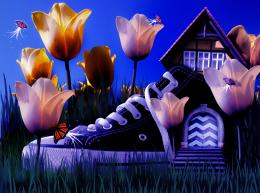 by chakra1985 5229 views - final score: 63% | dreamy 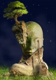 by jack2 5657 views - final score: 62.6% |
Secret Houshoe 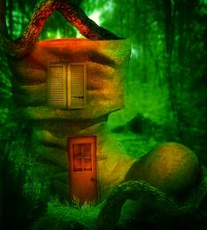 by eclipsy 7151 views - final score: 60.9% | Which Runner Is Faster 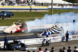 by Majkman 7791 views - final score: 59.6% | Dancing in the clouds 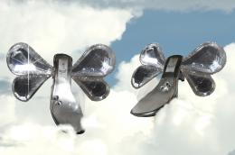 by artbybambi 7094 views - final score: 57.9% |
What Should I Wear? 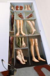 by Majkman 7762 views - final score: 57.3% |
Howdie Guest!
You need to be logged in to rate this entry and participate in the contests!
LOGIN HERE or REGISTER FOR FREE
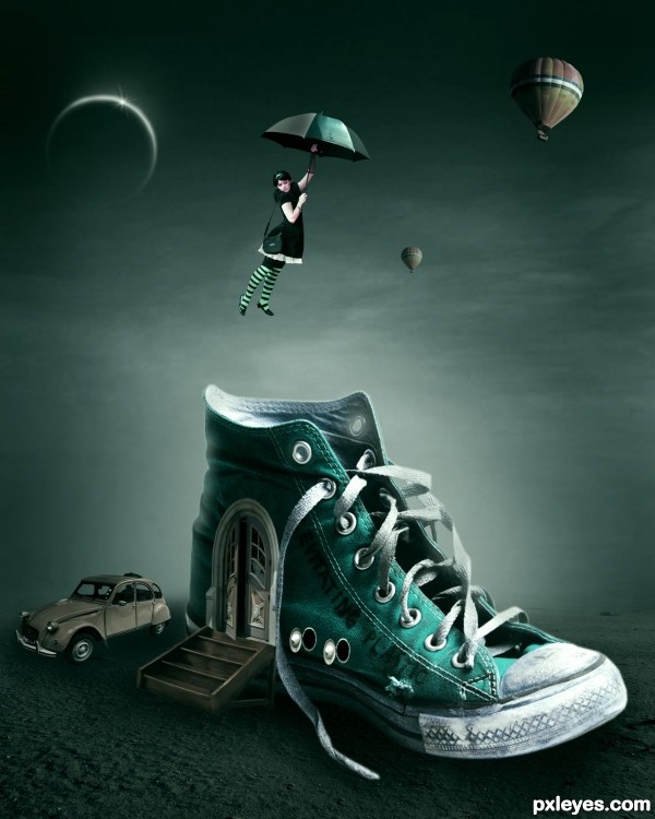
Very nice mood, but there are too many duplicated balloons. They all look the same, and distract too much from the rest of the image. I'd eliminate the largest and the smallest, and place the medium sized one below where the largest one now is. That will help direct the viewer's focus around the focal point of the shoe and the girl.
I'd also tone down the red car, as it competes too much with the red shoe, directing the eye off to the side.
The edge of the steps where they meet the door on the shoe is too hard edged, looking very cut and paste, a bit of blur will help there.
Better, but changing the shoe to blue still has the car too dominant, because now your focal point of the shoe blends too much with all the blue of the background...
The steps look much better, though, and the balloons are improved.
thanks for your support Mossy B
@Mossy B
edited 2nd time buddy
now looks better or not?
I've only seen this version, but it looks good. Car seems small compared to the girl. Flip the small balloon so the highlight is correct. GL author!
Wow, I like the story it tells, nice work!
@CMYK46
edited 3rd time friend
i think it looks better
Very nice work author with lovely mood...IMHO car is only thing that don't fit in this scene, but without the car that part of the image would be to empty...also car need darker under shadow, especially in back part cause now look like floating...fix that and u will have very cool image author...best of luck
@erathion
thanks for your suggestion friend
superbb work....n nice thinking author...
Like a fairytale. GL!
GL! 
I think there are many people confusing things.
I say this because of comments about size of the car, the girl ...
It's like tennis "home" was overlooked.
Everything is surreal, then, in my opinion, no matter if the girl is bigger than the car, if the balloons are similar, if the car is very small. It is a surreal theme, guys! But, is my personal opinion!
The work is fabulous! I loved it! Fav!
Congratulations, author!
suggest blur n fade partially the balloons to the background, this will enhance the focal point on the girl n shoe-house...
 congrats!
great image
I agree with Daniela. This is a fine chop to you Author
nice concept author gl
yeah....my favorite mood on this pic, I love the dark greenish tone.....! and my fav entry too....oh well the best so far...good luck...
Astounding
Congrats kush!!
Congrats!!
Congrats!!
thanks irene, spaceranger and Olesya
Cograts!!! Great job!
Congrats!
Howdie stranger!
If you want to rate this picture or participate in this contest, just:
LOGIN HERE or REGISTER FOR FREE