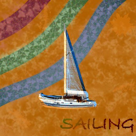
used this tutorial: http://www.webdevtuts.net/photoshop-2/create-a-retro-design-poster-in-photoshop/ (5 years and 3264 days ago)
1 Source:
- 1: boat
Retro-Spectrum  by Robart523 18868 views - final score: 67.1% | Retro Poster  by CorneliaMladenova 23494 views - final score: 66% | Ace-of-Spades  by CorneliaMladenova 27804 views - final score: 64.8% |
Dancing in the dark  by imnicole 9074 views - final score: 61.1% | Retro-Stang  by lchappell 6894 views - final score: 61% | This is not an Apple  by ramsesje 9350 views - final score: 61% |
Car Club Poster  by lchappell 4869 views - final score: 60.7% | Retro Girl  by chakra1985 5873 views - final score: 60.4% | Advertising  by filantrop 3811 views - final score: 60% |
A Streetcar  by Deki 3649 views - final score: 59.3% | Pitlochary Farm 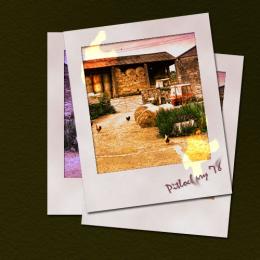 by Heathcliffe 4526 views - final score: 56.8% | Retro Grunge Poster 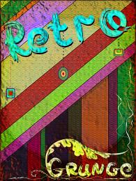 by CorneliaMladenova 25240 views - final score: 56.4% |
Phony Graph with Dots  by Drivenslush 6814 views - final score: 56.3% | Back in the Day  by Heathcliffe 4441 views - final score: 56.2% | cool portrait  by maozbd 5143 views - final score: 55.5% |
sailing  by happyme27 5345 views - final score: 55.3% |
Howdie Guest!
You need to be logged in to rate this entry and participate in the contests!
LOGIN HERE or REGISTER FOR FREE
Photography and photoshop contests
We are a community of people with
a passion for photography, graphics and art in general.
Every day new photoshop
and photography contests are posted to compete in. We also have one weekly drawing contest
and one weekly 3D contest!
Participation is 100% free!
Just
register and get
started!
Good luck!
© 2015 Pxleyes.com. All rights reserved.


Fun, except the wavy stripes stand out more than the boat and (especially) the text. (Try greater contrast for the latter two elements.)
updated a bit--hope you like it
Nice improvement. This came out well!
please let me know if you like this one better, or if I should go back to the old one
I like this version, the old one had too much noise for my taste...
I don't care much for the way the lettering is kind of faded at the beginning, though.
Howdie stranger!
If you want to rate this picture or participate in this contest, just:
LOGIN HERE or REGISTER FOR FREE