
Used the Polaroid tutorial as guidelines with a few extra tweaks here and there (5 years and 3179 days ago)
Retro-Spectrum  by Robart523 18438 views - final score: 67.1% | Retro Poster  by CorneliaMladenova 22864 views - final score: 66% | Ace-of-Spades  by CorneliaMladenova 27079 views - final score: 64.8% |
Dancing in the dark 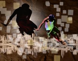 by imnicole 8935 views - final score: 61.1% | Retro-Stang  by lchappell 6785 views - final score: 61% | This is not an Apple  by ramsesje 9133 views - final score: 61% |
Car Club Poster  by lchappell 4760 views - final score: 60.7% | Retro Girl  by chakra1985 5720 views - final score: 60.4% | Advertising  by filantrop 3724 views - final score: 60% |
A Streetcar 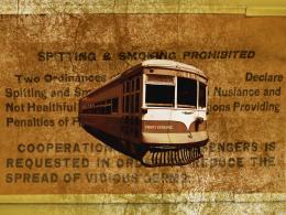 by Deki 3562 views - final score: 59.3% | Pitlochary Farm 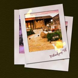 by Heathcliffe 4429 views - final score: 56.8% | Retro Grunge Poster  by CorneliaMladenova 24602 views - final score: 56.4% |
Phony Graph with Dots  by Drivenslush 6670 views - final score: 56.3% | Back in the Day  by Heathcliffe 4301 views - final score: 56.2% | cool portrait  by maozbd 5043 views - final score: 55.5% |
sailing  by happyme27 5259 views - final score: 55.3% |
Howdie Guest!
You need to be logged in to rate this entry and participate in the contests!
LOGIN HERE or REGISTER FOR FREE
Photography and photoshop contests
We are a community of people with
a passion for photography, graphics and art in general.
Every day new photoshop
and photography contests are posted to compete in. We also have one weekly drawing contest
and one weekly 3D contest!
Participation is 100% free!
Just
register and get
started!
Good luck!
© 2015 Pxleyes.com. All rights reserved.


Love the smears on the handwriting.
The edges of the "Polaraoids" are a bit too rough and choppy, though. I'd make them clean and smoother, just to give it a bit more "real" feeling.
Nice job!
Thank you - I preferred them smooth too first time looking at it - I'll try sort it out - thanks for your help
No problem! Looks much better now!
I like the updating of the lame "vintage" [never happened!] Polaroids from the mandated tutorial. For a true Polaroid, the white border should be on the same plane as (be essentially part of) the image so the border shouldn't cast any shadow on the image. Also, Polaroids tended to be a bit washed out, i.e., low saturation, unlike here. I like the smeared handwriting but I don't get the light-leak hot spots, especially their encroachment on the non-photosensitive border.
Howdie stranger!
If you want to rate this picture or participate in this contest, just:
LOGIN HERE or REGISTER FOR FREE