(5 years and 3174 days ago)
Edge of Darkness  by eclipsy 17983 views - final score: 71.6% | Hope  by DanielaOwergoor 12438 views - final score: 66.3% | Windows To Heaven  by jordyponce 15255 views - final score: 66.1% |
Demolition  by imnicole 11373 views - final score: 62.9% | Silent Prayer 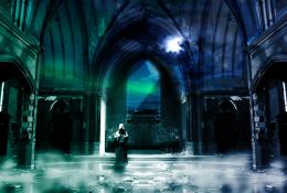 by AngeldustUK 12386 views - final score: 62.5% | Dream 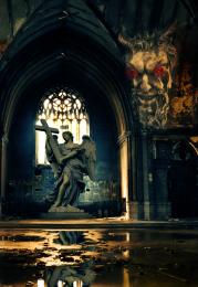 by Mario 9964 views - final score: 62.3% |
Sad Angel 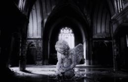 by jordyponce 10944 views - final score: 61.8% | Beginning the Reversal 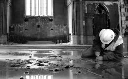 by Drivenslush 6043 views - final score: 61.3% | omnia vincit amor 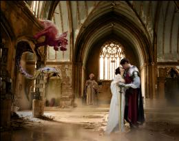 by dustfinger 15813 views - final score: 61.3% |
you lose its coming down 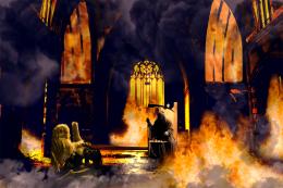 by jack2 8965 views - final score: 60.8% | The dream is over 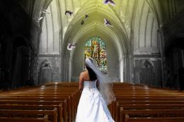 by gchiou2008 7473 views - final score: 60% | flood 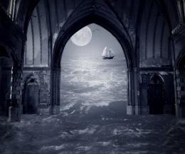 by Se7eN0f9 5146 views - final score: 59.5% |
Flooded 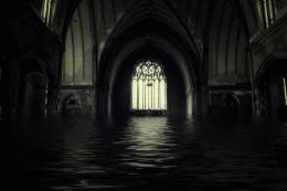 by jordyponce 6196 views - final score: 59.3% | Follow Your Path 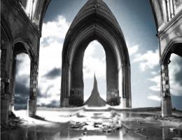 by Wishfulthinking 7517 views - final score: 59% | Christo Redentor 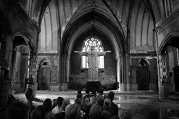 by Darkrider92 7050 views - final score: 59% |
vacation 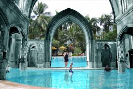 by jack2 3640 views - final score: 58.4% | Day at the beach 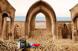 by AngeldustUK 6117 views - final score: 58.1% | Angeline 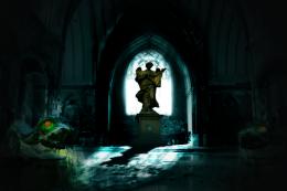 by vinshine 9611 views - final score: 57.8% |
Deadly church 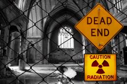 by sebstgelais 5444 views - final score: 56.9% | Art wave ! 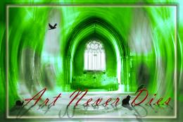 by Greatpapa 6723 views - final score: 54% | soldier... 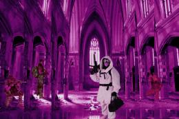 by mehul 5840 views - final score: 51.9% |
Howdie Guest!
You need to be logged in to rate this entry and participate in the contests!
LOGIN HERE or REGISTER FOR FREE
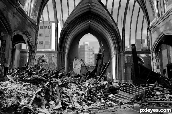
You should tear out a section of the roof ribbing - it looks too "perfect" for all the debris on the bottom.
Wow! Very convincing! Well done.
You might consider taking out some of the ceiling ribbing. to better match all the destruction and rubble. The roof is still too "perfect" looking.
Nice Blend Author.. Good Luck!
Good job; looks convincing (may be you could flip the background so it matches the direction of light on the church).
Good job, well blended (May be you can flip the background to match the lighting direction).
Well done, believable result. Nitpick would be that the background buildings get their light from the opposite compared to the foreground, but that would be a matter of flipping. The mess in front fits well, nice masking. Good luck!
Wow, good idea and lots of tedious work here, nice chopping (literally)!
Howdie stranger!
If you want to rate this picture or participate in this contest, just:
LOGIN HERE or REGISTER FOR FREE