(5 years and 3155 days ago)
The storm is coming soon...  by DanielaOwergoor 11676 views - final score: 66.3% | Frozen  by jordyponce 10629 views - final score: 65.8% | Beware of Evils on Thin Ice  by Drivenslush 10688 views - final score: 65.6% |
Bear Country 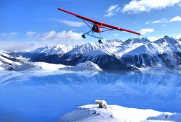 by lchappell 8769 views - final score: 63.2% | A snowy day 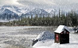 by DigitalDreamer 14605 views - final score: 62.4% | USS Honolulu is where? 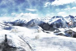 by woodztockr 9749 views - final score: 61.5% |
Publicity Photo 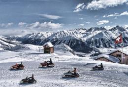 by Drivenslush 5386 views - final score: 60% | A Cry in the Daylight  by Drivenslush 5534 views - final score: 59.3% | Out of the way !  by gchiou2008 5685 views - final score: 59% |
rain forest  by maozbd 6793 views - final score: 56.9% | desert 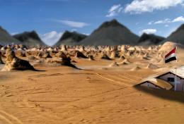 by maozbd 4785 views - final score: 55.4% | Golden mountains 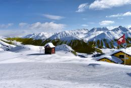 by RoninSamurai 9062 views - final score: 55.3% |
Howdie Guest!
You need to be logged in to rate this entry and participate in the contests!
LOGIN HERE or REGISTER FOR FREE
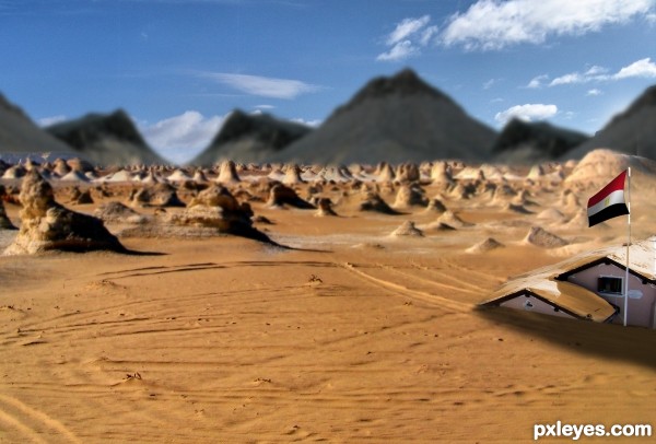
The blurry background really hurts this image, because the distand mountains are in sharper focus than the blurred midground...
Also, the edges of the cut out contest source are too hard, and do not blend at all with the desert scene.
the focus-thing is not done properly...
suggest:
1) clone some sand at bottom of hut
2) soften all edges of the mountains-peaks
3) make only ONE focal object (either the hut or the house on the right)
composition of image ... (don't be angry) ... lacks "wow" and "ooh"
thank you very much for the suggestions
The focus looks better, and the composition is improved by getting rid of the small building. Now, you should re-color the snow on the roof to look like sand, then the building would look "buried."
thank you very much mossy
does it look better now?
Good job of blending the snow into the sand. Big improvement from your original image!
I don't see any blending of the snow, just replacement. First of all, I'd like to say that I find the idea very good. Your image does not look real, though. The house in the foreground is sharp, right behind it the ground starts to be out of focus, gives it kind of a miniature look. There are parts in focus still, for example, the first rock on the left. The tipp is out of focus, the bottom is IN focus. And there are parts in the middle that are in focus. The background mountains are way out of focus, yet the sky is in focus. You see what I mean? It just does not look real.
.... the dark mountains don't look right.
if you like, you can change the color to dark brown or something
Howdie stranger!
If you want to rate this picture or participate in this contest, just:
LOGIN HERE or REGISTER FOR FREE