(5 years and 3164 days ago)
1 Source:
cat in the glow of the light  by scratzilla1 15562 views - final score: 68.2% | Furcav  by itsdesign 7511 views - final score: 65.3% | Life  by CorneliaMladenova 7108 views - final score: 63.6% |
That's What the Water Gave Me 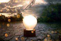 by ponti55 13715 views - final score: 63.1% | Biohazard  by Deki 9741 views - final score: 62.2% | lady of the light 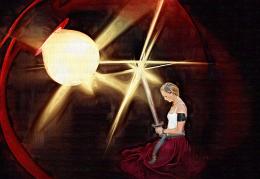 by kathyw 6915 views - final score: 61.9% |
Incertitude 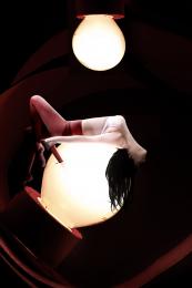 by Akassa 4714 views - final score: 61.6% | Bult Plant 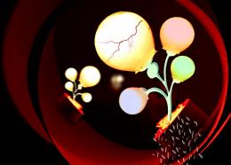 by shaiju1974 5902 views - final score: 60.6% | Maria Mox 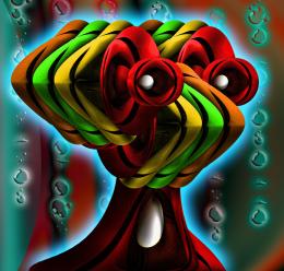 by Drivenslush 5478 views - final score: 60.4% |
The light is dimming 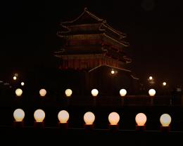 by adelia 7148 views - final score: 59.8% | Glowing light bulb  by Darkrider92 8399 views - final score: 58.3% | Happy 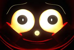 by jordyponce 4792 views - final score: 57.9% |
change to yellow bulb 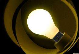 by wooyuenfoo 9081 views - final score: 57.9% | Beautiful Devil Eyes 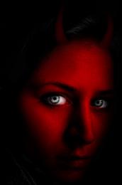 by jordyponce 10501 views - final score: 57.8% | In The Water 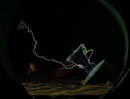 by GlennD 10246 views - final score: 57.7% |
Punk Bulb 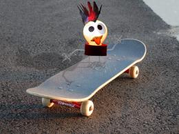 by angelaj 7664 views - final score: 56.7% | New Life 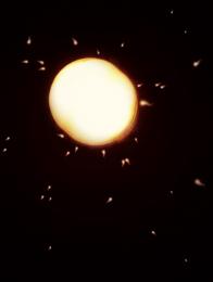 by jordyponce 4802 views - final score: 56.1% |
Howdie Guest!
You need to be logged in to rate this entry and participate in the contests!
LOGIN HERE or REGISTER FOR FREE
Good that you added an sbs, or I wouldn't see how you used the source. Your use of source is quite minimal.
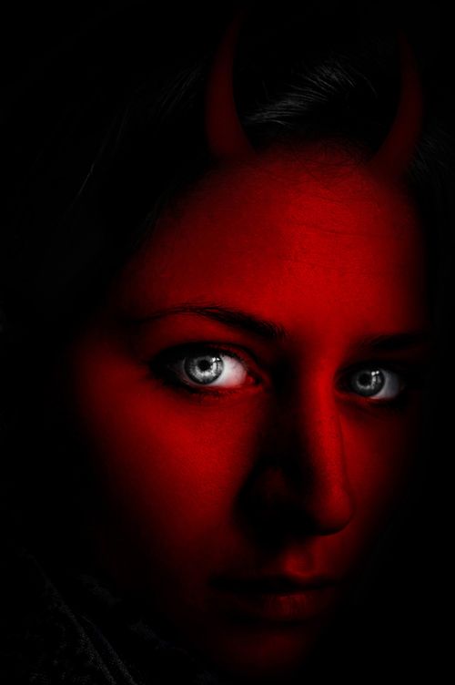
On the horns...they look very 2 dimensional, and not actually attached to her head. Perhaps work on blending them in better. They also are not evenly spaced or balanced on her head either. Look at pictures of horned animals to get a grasp on what I mean, but pay close attention how those horns grow from the skull of the animal, not just sit atop the skin. Your horns need to be better seated in the skull.
I hope that's not to crtitical, I just think it would help.
good work author gl
Take Jade's advice. This isn't a great use of the source, but you can easily improve it.
Thanks for all comments!!..I'll try to make some changes soon.
Too minimal a use of the source, and a somewhat lackluster manipulation because the overall values are too dark. The horns are barely visible at all.
Yes to minimal use of Source Image, the Main Source Object is the light bulb not the Red light from the Background. The Horns looks 2D, not realistic, not authentic.
Howdie stranger!
If you want to rate this picture or participate in this contest, just:
LOGIN HERE or REGISTER FOR FREE