(5 years and 3154 days ago)
1 Source:
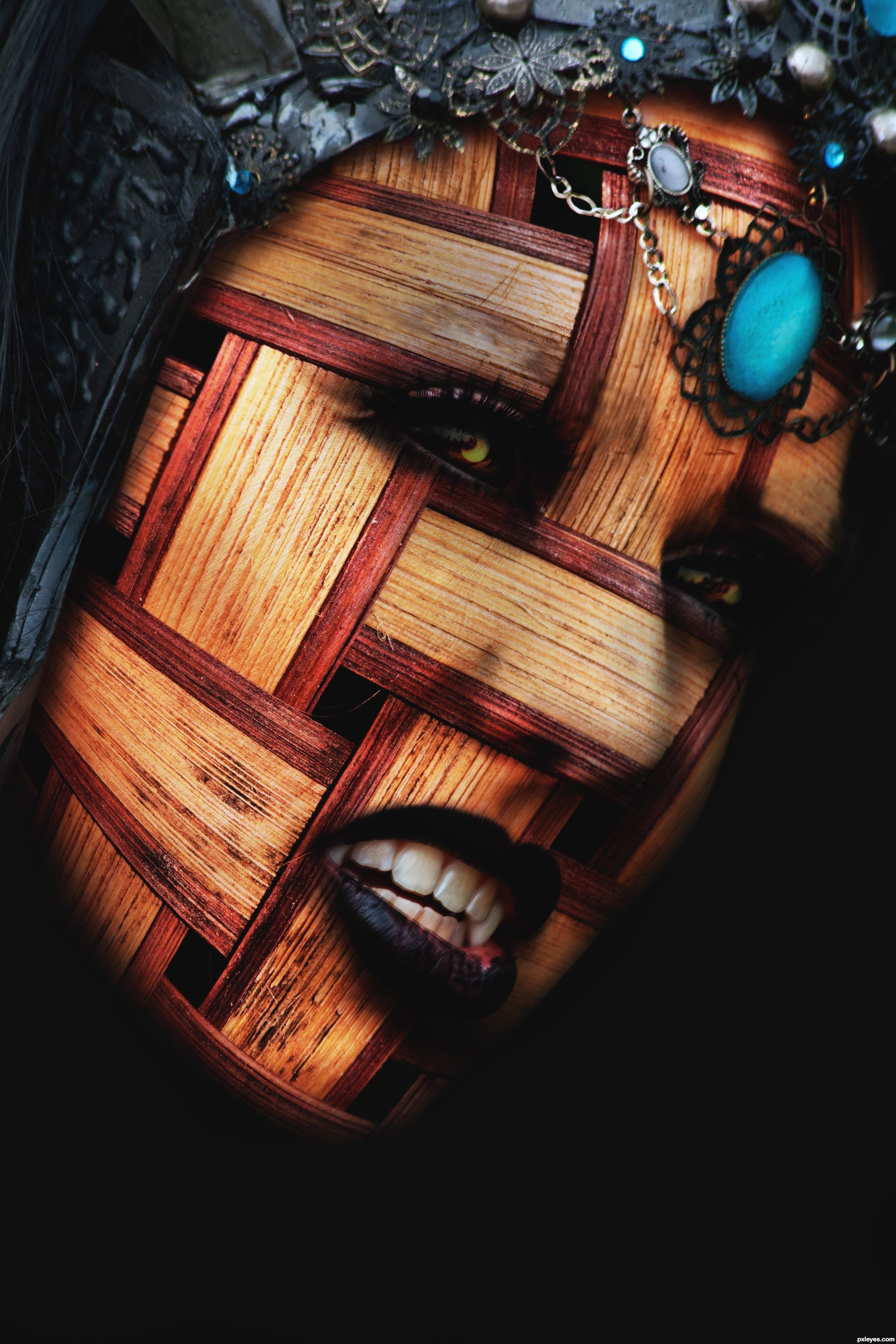
- 1: face
Vigil  by IDt8r 11658 views - final score: 77.3% | The First Weaver  by IDt8r 11706 views - final score: 74.3% | Where Little Birds Live  by George55 15005 views - final score: 73.2% |
WOODY ALIEN 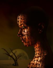 by lolu 15207 views - final score: 73.1% | Battle Pandora  by kushpatel 10174 views - final score: 69.5% | land of death  by kushpatel 7031 views - final score: 68.5% |
Confined  by DanielaOwergoor 4594 views - final score: 68.3% | Still Life With Peaches 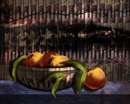 by George55 7931 views - final score: 68.2% | WVE 453 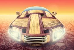 by itsdesign 6922 views - final score: 67.6% |
Fly away 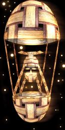 by shaiju1974 8714 views - final score: 65.9% | Mystic 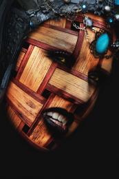 by layerstack 6714 views - final score: 65.8% | Sneaking the Squeaky 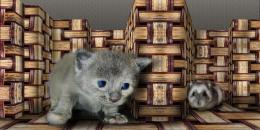 by Drivenslush 5400 views - final score: 65.3% |
I'll Tumble 4 Ya  by Drivenslush 5057 views - final score: 65.1% | Yoga Stretch 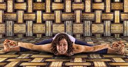 by Drivenslush 8300 views - final score: 64.7% |
Howdie Guest!
You need to be logged in to rate this entry and participate in the contests!
LOGIN HERE or REGISTER FOR FREE
Photography and photoshop contests
We are a community of people with
a passion for photography, graphics and art in general.
Every day new photoshop
and photography contests are posted to compete in. We also have one weekly drawing contest
and one weekly 3D contest!
Participation is 100% free!
Just
register and get
started!
Good luck!
© 2015 Pxleyes.com. All rights reserved.


Great concept, the eyes look a bit like shadows to me, is it supposed to be that way?
Try using a displacement map:
http://www.photoshopessentials.com/photo-effects/texture-map/
@ Akassa, I wanted to create some depth and 'mystery' maybe a bit too much then?

@CMYK46, Yes i know about displacement maps. The face i felt was to 'white' and i didn't want to mess aropund trying to get a good enough contrast. Then i thought i may as well try it this way just to show you can still get results if people find displacement maps complicated.
Thanks for your comments guys....vote would have been nice too
Cool!
OK then, if you don't wanna use a displacement map (which would have made the weave conform to the curves on the face) then use the highlights on the source face to guide your dodging. The head needs more highlights.
The nose area looks odd, somewhat blurry and indistinct. I think the right eye is too shadowy - not mysterious, so much as too dark. Perhaps lighten the eye white VERY slightly for better contrast. Then it'll just look super smudgy...
I love it! So realistic! Very well done author!
Howdie stranger!
If you want to rate this picture or participate in this contest, just:
LOGIN HERE or REGISTER FOR FREE