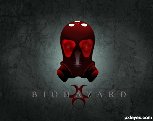
Created from parts of source image. Mostly liquify tool, a lot of blending and external source background.Had to re-do the background because the one i used was not approved by MOD. (5 years and 3163 days ago)
- 1: Background

Created from parts of source image. Mostly liquify tool, a lot of blending and external source background.Had to re-do the background because the one i used was not approved by MOD. (5 years and 3163 days ago)
cat in the glow of the light  by scratzilla1 15567 views - final score: 68.2% | Furcav  by itsdesign 7513 views - final score: 65.3% | Life  by CorneliaMladenova 7110 views - final score: 63.6% |
That's What the Water Gave Me 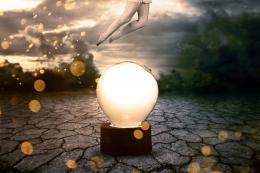 by ponti55 13719 views - final score: 63.1% | Biohazard  by Deki 9743 views - final score: 62.2% | lady of the light 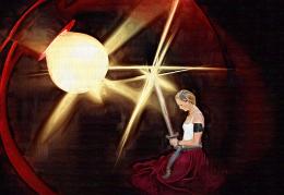 by kathyw 6919 views - final score: 61.9% |
Incertitude 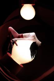 by Akassa 4716 views - final score: 61.6% | Bult Plant 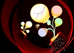 by shaiju1974 5904 views - final score: 60.6% | Maria Mox 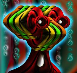 by Drivenslush 5482 views - final score: 60.4% |
The light is dimming 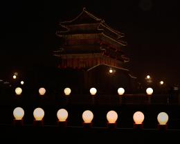 by adelia 7151 views - final score: 59.8% | Glowing light bulb 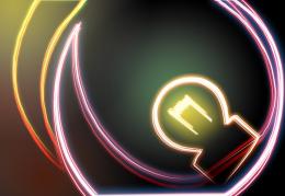 by Darkrider92 8402 views - final score: 58.3% | Happy 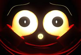 by jordyponce 4793 views - final score: 57.9% |
change to yellow bulb  by wooyuenfoo 9082 views - final score: 57.9% | Beautiful Devil Eyes  by jordyponce 10504 views - final score: 57.8% | In The Water  by GlennD 10253 views - final score: 57.7% |
Punk Bulb  by angelaj 7668 views - final score: 56.7% | New Life  by jordyponce 4804 views - final score: 56.1% |
Howdie Guest!
You need to be logged in to rate this entry and participate in the contests!
LOGIN HERE or REGISTER FOR FREE
Nice image. Might be good if the type was more visible.
I agree... Maybe white or bright gray make it look better (:
thanks guys......done
Very creative idea! Looks good.
Much much better Good luck!
Overall this looks good, great concept, text looks dead on to me. I think if you were to create some more depth in the area of the eyes and breather filters you would have a better image. Try creating a shadow effect around the inner portion of the eye lens area, maybe use the burn tool carefully for this shading. Nice job on this, I do like it. Good luck.
I apologize to all that voted for my entry on monday, but apparently i used image background that was made and i guess that is no allowed so i made my own that is not good as the one i had before but i like it
thanks all
Can you make a dark vignette on your new background? I think it would be closer to your original image. GL author.
thanks CMYK... got that done
Lookin' good!
Nice poster
Howdie stranger!
If you want to rate this picture or participate in this contest, just:
LOGIN HERE or REGISTER FOR FREE