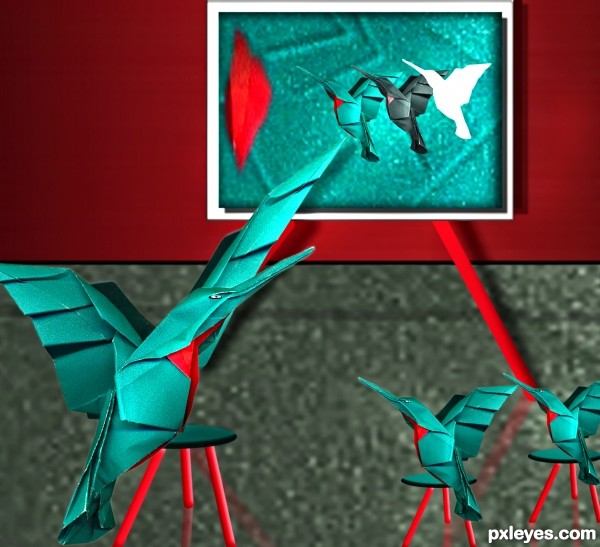
only source image and PS used. (5 years and 3168 days ago)
The Nest  by ponti55 23617 views - final score: 66.3% | Bird Robot  by GlennD 18754 views - final score: 64.6% | Glenda Rainbowlyn  by Drivenslush 13823 views - final score: 62.7% |
transformer bird face 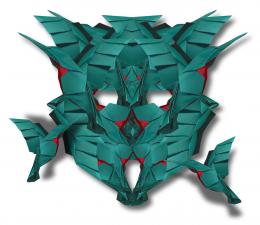 by wooyuenfoo 17672 views - final score: 61.9% | When night falls 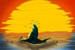 by Vexycon 17890 views - final score: 61.5% | bird likes coffee?  by maozbd 8074 views - final score: 59.6% |
The Kiss  by jordyponce 5153 views - final score: 59.6% | ready for fight... 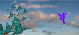 by maozbd 6091 views - final score: 58.8% | Hi kids.. look how we...  by shaiju1974 6368 views - final score: 58.6% |
Origami-z 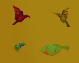 by designed 5781 views - final score: 58% | Night Eater  by jordyponce 4785 views - final score: 57.9% | Tribal outfit  by JimLemon 6753 views - final score: 57.6% |
bird  by maozbd 4735 views - final score: 57.4% | Moon Suckers  by jordyponce 5315 views - final score: 57% |
Howdie Guest!
You need to be logged in to rate this entry and participate in the contests!
LOGIN HERE or REGISTER FOR FREE
The background is very crude looking, and even with the reflections, the stools look like they are floating. The separation line between the wall and the floor is almost in the center of your image, a compositional "no no," as it bisects the image.
It's an original idea, but the techinical execution leaves something to be desired, and only using the source image does not warrant much.
Howdie stranger!
If you want to rate this picture or participate in this contest, just:
LOGIN HERE or REGISTER FOR FREE