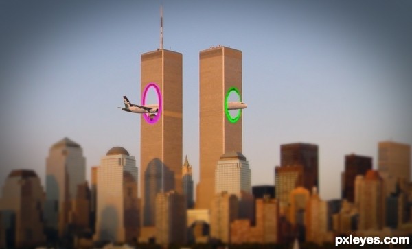
I changed the colors of the portals, i hope now i'm legal, and not break any copyright laws... (5 years and 3157 days ago)
- 1: City source

I changed the colors of the portals, i hope now i'm legal, and not break any copyright laws... (5 years and 3157 days ago)
L.M.L.B.  by kushpatel 6243 views - final score: 67% | new life  by mehul 10947 views - final score: 66.8% | Calm  by GlennD 9186 views - final score: 63.2% |
Whoops !! Too close !!  by meatman 7471 views - final score: 61.5% | Incoming boats 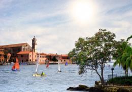 by JimLemon 7175 views - final score: 60.3% | Starry Skies 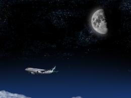 by ganjagoddess 9332 views - final score: 60.2% |
Tornado  by Darkrider92 6524 views - final score: 58.5% | Plane Tree 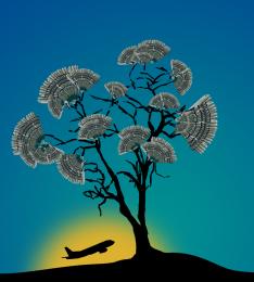 by Gorzaki 9674 views - final score: 58.4% | Dark Times  by Norman 6227 views - final score: 56.1% |
What would have been if...? 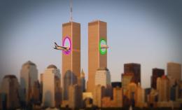 by Darkrider92 8587 views - final score: 52.4% |
Howdie Guest!
You need to be logged in to rate this entry and participate in the contests!
LOGIN HERE or REGISTER FOR FREE
LOLOL! Great image!
Have you seen the new movie short that came out?
http://www.youtube.com/watch?v=4drucg1A6Xk
Thank you MossyB !
Yes, i've seen it. From that came inspiration
I LOVE THAT VIDEO!!
Plane parts are at the wrong angle. They don't match up. Plane should be the same gray as the source pic, and not same hues as the buildings, to create contrast.
I love the idea, lol!
Nice
CMYK46, i agree with you for the wrong angle of the plane, but only on the back of the plane...i simply can't do the right perspective I'm not good enough, i'm a begginer, and i want to learn as much as possible, but i can't do it right, i tried a lot...
I think the colors are good... why the plane should be the same gray as the source pic, if it match the city photo.. ?
For contrast! And all you had to do to match the angle on the plane parts was draw a line down the axis of the tail section (on a separate layer) and match up the nose section according to that line and it would be visually correct.
I'm not sure about blurring the foreground either, but I still like the idea of your image, and hope my comments have helped you.
I see now what you meant with the angle... I first thinked about the perspective of the back.
You are right, the plane seems a little broken...and i verified now, the front was JUST a litle rotated and smaller, i alligned them perfectly now, and i will upload the result... not much difference. Probably this is the way that portals works
Lol, like it. Not sure about your angle discussion here. If there's anything wrong here, it would be that the wings would still crash in that building.
Yes you're right...
nice..
Thank you !
what exactly is this supposed to represent ?? is it from a movie or what ?? that was a terrible tragedy that day.
Good Idea..lol!!
How I wish this had happen! Wonderful work author!
Howdie stranger!
If you want to rate this picture or participate in this contest, just:
LOGIN HERE or REGISTER FOR FREE