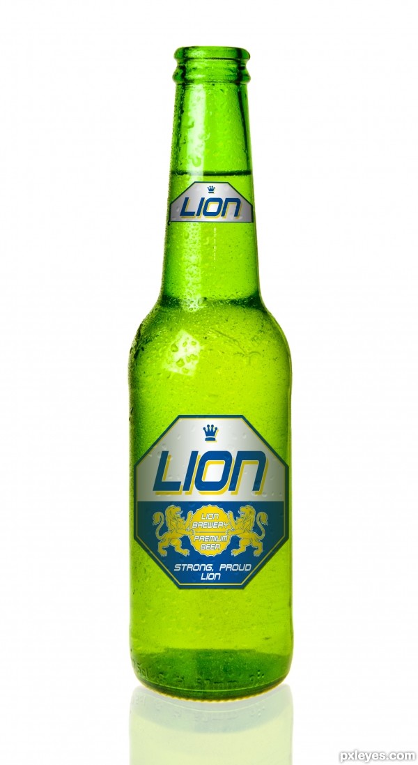
have a refreshing sip of lion beer in the evening, quenches your thirst and gives you new strength for next days work.
Please have a look at the full res, thank you. (5 years and 3157 days ago)
Lion beer  by Derivatix 16017 views - final score: 67.7% | The Lord God Made Them All  by Drivenslush 14128 views - final score: 66% | Dino Skinno  by JimLemon 8460 views - final score: 62.9% |
Baby's First Salsa 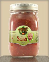 by pearlie 10161 views - final score: 62.6% | War Milk 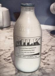 by Drivenslush 9749 views - final score: 62.5% | Drink Me 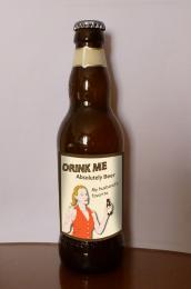 by Augustinaart 4770 views - final score: 61.3% |
Coteaux de Yeux Pixel by WYSIWYG 7337 views - final score: 60.8% | Bottled Genie 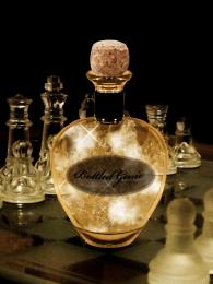 by ganjagoddess 6022 views - final score: 60.3% | Sand in a Bottle  by ramsesje 5803 views - final score: 58.4% |
A Run into the Primary Colors  by Drivenslush 7350 views - final score: 58.1% |
Howdie Guest!
You need to be logged in to rate this entry and participate in the contests!
LOGIN HERE or REGISTER FOR FREE
Very well done!
very realistic, it's good!
great work...
Nice label, but the lighting is off. The bottle shows lighting from the left, while the label is lit from the center. Other than that, this is very well done.
thank you MossyB, I can understand your point of view but I'd like to disagree. Don't be fooled by that highlight on the bottle neck. It's just the reflection of a small striplight to model the bottle.
If you look at it a bit longer, you will find that the light on the bottle is very even. I actually used 4 lights for this shot, one coming from behind to make the liquid inside glow, one from the bottom, one from the front and that small striplight to put a highlight on the bottle neck. If you look at books regarding product photography you will see how it's done. Lion beer would not want the light to be off center when advertising the product.
Very compelling with lots of appealing nuances. I do feel repeating "LION" after "STRONG, PROUD" is an unnecessary redundancy, however. What especially concerns me are the perfectly straight horizontal edges/elements of the labels that are clearly on a curved surface. (Note, for example, the disconnect between the curved bottom of the bottle and the straight bottom of the big label.)
I Like it!!!..
thank you all very much for your comments, I really appreciate them. About the straight horizontal lines: I do not see them to be a problem, as the label is pretty much level with the eye, whereas the bottom is slightly below. If you look at a bottle standing in front of you, you will notice that the higher your eyes go, the curvier the bottom gets. If your eyes are level with the bottom, you will see the bottom as a straight line. But thank you for pointing that out, it's an interesting aspect.
great..
Great job author...one of the best in the contest for sure...best of luck
Clean work of art! One of my favorites indeed!
Congrats well done
Congrats!!
Congrats on your Win
Howdie stranger!
If you want to rate this picture or participate in this contest, just:
LOGIN HERE or REGISTER FOR FREE