
thanks to redzonk
thanks to yenhoon (5 years and 3165 days ago)
3 Sources:
Lion beer 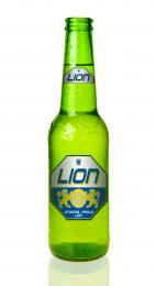 by Derivatix 16041 views - final score: 67.7% | The Lord God Made Them All 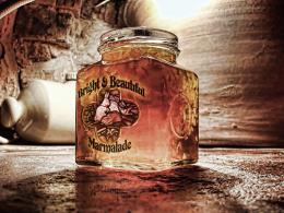 by Drivenslush 14158 views - final score: 66% | Dino Skinno 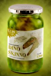 by JimLemon 8469 views - final score: 62.9% |
Baby's First Salsa 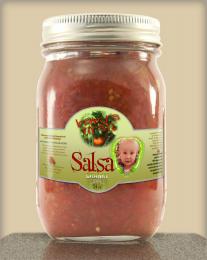 by pearlie 10177 views - final score: 62.6% | War Milk 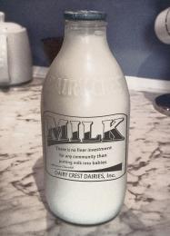 by Drivenslush 9760 views - final score: 62.5% | Drink Me 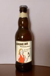 by Augustinaart 4780 views - final score: 61.3% |
Coteaux de Yeux Pixel by WYSIWYG 7355 views - final score: 60.8% | Bottled Genie 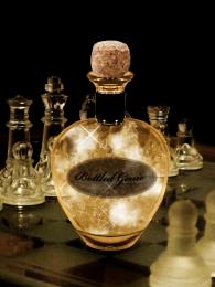 by ganjagoddess 6040 views - final score: 60.3% | Sand in a Bottle 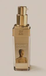 by ramsesje 5811 views - final score: 58.4% |
A Run into the Primary Colors 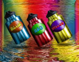 by Drivenslush 7372 views - final score: 58.1% |
Howdie Guest!
You need to be logged in to rate this entry and participate in the contests!
LOGIN HERE or REGISTER FOR FREE
The "Sand in a bottle" label is blurry and hard to read. I wouldn't use a drop shadow with text.
I like the "give yourself a beach tan" text, but the "sand in a bottle text" is kind of hard to read. What you might try is using the same technique you used for the "give yourself..." text on the "sand..." text, only make the text dark and the shadow light, know what I mean? Maybe you'll like that better.
thank you for the comment and advice
I'll see what I can do tomorrow
realistic work author..
thank you Kushpatel
@ Mossy B and IDt8r I made some changes to the text "sand in a bottle"
I also added an sbs
I like the change. It looks very classy.
Much easier to read, good improvement!
More contrast would be punchier. And shouldn't it be "TAN in a Bottle"? For me, the sand is an irritant, not an objective, when I go to the beach; the last thing I want to do is spray sand on myself. (Or is this somehow an exfoliant?)
@ DanLundberg - It was ment humoristic - with the picture of the woman all covered with sand
I will have one for me here! lol
Howdie stranger!
If you want to rate this picture or participate in this contest, just:
LOGIN HERE or REGISTER FOR FREE