
IMPACT FONT
I created a very generic concept for the t-shirt, figuring the lighting and the travel time would add to the shirts appearance as it travels (5 years and 3145 days ago)
Yippee!! World Tour!!  by iquraishi 13954 views - final score: 67.5% | Around the World in 365 Days  by Majkman 12194 views - final score: 67% | On Tour  by Hayato 13203 views - final score: 64.3% |
PXL World Tour  by lchappell 9838 views - final score: 62.9% | Around the world in an year!  by iquraishi 10163 views - final score: 62.2% | on tour  by kushpatel 3449 views - final score: 62.1% |
Up up and away  by Milena 9336 views - final score: 61.6% | Around the world  by robvdn 5864 views - final score: 60.9% | On Tour  by robvdn 3922 views - final score: 60.8% |
PXLeyes On Tour  by solkee 4908 views - final score: 60.4% | Pxl On Tour  by jordyponce 6359 views - final score: 60.3% | ...simple T  by Drivenslush 3465 views - final score: 60.2% |
Aliquam in PXL  by lchappell 5103 views - final score: 59.7% | Luckiest person in the world  by steelclaw 8108 views - final score: 59.3% | we are family  by kushpatel 5840 views - final score: 59% |
simple  by kushpatel 4282 views - final score: 58.2% | world tour.. 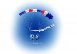 by mounirupa 6010 views - final score: 57.4% | PXL On tour 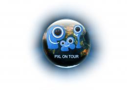 by mounirupa 5877 views - final score: 57% |
Pxleyes.com World Tour  by Chuck 6647 views - final score: 55% | Join Us On Our World Tour 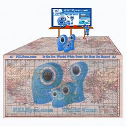 by Chuck 8497 views - final score: 54.2% | traveling SHIRT  by scratzilla1 6114 views - final score: 53% |
The Great World Wide Tour  by Chuck 7951 views - final score: 52.9% |
Howdie Guest!
You need to be logged in to rate this entry and participate in the contests!
LOGIN HERE or REGISTER FOR FREE
It is simple but beautiful at the same time! best of luck author!
Simplicity can be good, and this would look great on a white T-shirt. The URL on the bottom provides a bit of explanation along with advertising (you can't get ahead without marketing!). I might consider making the URL dark blue to separate it from the "ON TOUR," however.
Great and simple, I like it!
Maybe you can turn it into a portrait so the design can be bigger on the shirt? And maybe also add "www." in front of the URL?
got it robvdn (do people still use www. ?)
I think it would look cool on a tee shirt, plenty of room for autographs.
This is a great logo. Nice and simple. Good luck!
very effective...
Simple yet very effective. The looks also very attractive. Best of luck my friend. Also a fav here.
Less is more! Love this! Very effective! would love to wear a shirt with this on it! Good luck author
Howdie stranger!
If you want to rate this picture or participate in this contest, just:
LOGIN HERE or REGISTER FOR FREE