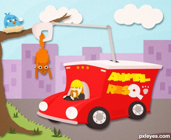
NOTE: This entry has been edited, so it no longer features external sources. Instead, it's been applied a little noise on it. (5 years and 3235 days ago)
air ship  by Se7eN0f9 10158 views - final score: 69.6% | 2012  by yoguy108 8611 views - final score: 69.4% | Stuck Here  by fatz8016 10881 views - final score: 66.7% |
Note-book  by CorneliaMladenova 7512 views - final score: 66.5% | Beautiful Nature  by jordyponce 10134 views - final score: 64.8% | Crystal Ball  by Nator 9348 views - final score: 63.1% |
Fantasy  by Mikaelbg 8904 views - final score: 62.1% | Angels masck 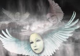 by mazanda 7643 views - final score: 61.4% | Not this time, Mr. Kitty 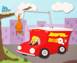 by JimLemon 7402 views - final score: 60.7% |
planets of the apes 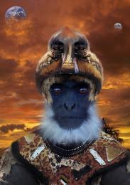 by andi 7340 views - final score: 60.3% | Cat Portrait 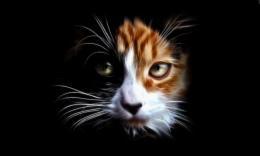 by jordyponce 5193 views - final score: 58.5% | the tears of the cut tree  by mazanda 9649 views - final score: 54.6% |
Yellow Cute Smurf  by jordyponce 6539 views - final score: 53.2% |
Howdie Guest!
You need to be logged in to rate this entry and participate in the contests!
LOGIN HERE or REGISTER FOR FREE
This is cute, but would have been better if the newspaper ads were about pets, rather than real estate...
Hehe I know, but sources weren't so gentle this time!
Very cute. I find the newspaper ads distracting. I'm not so keen about the paper texture either, especially when it makes it appear that the tree, grass, road, truck, skyline, and sky are the same piece of paper and not different layers after all. I prefer Step 8 (with maybe slightly stronger shadows).
Granted! No more textures! How is it looking now?
Nice to see the newsprint gone. It's a lot cleaner looking.
I like the stronger shadows but the texture is still distracting 'noise' to me. I think the texture needs to be just barely noticeable so the surface doesn't seem to be quite perfectly flat. I would also like the different blue bands in the sky shine through. (More contrast could add more punch overall.)
On closer scrutiny, why doesn't the claw 'thumb' cast a shadow on the squirrel tail? And the truck driver could cast some shadow on the truck.
My concept was to have something like pieces of paper that together forms the image. The truck plus the driver and the claw along are a layer, the cat's another, the bird's another... you get it. The shadows are there because without them I found my composition pretty dull, same for the noise filter.
Thank you! That was the idea
nice ......... nice ..................... nice ---------- ok I'll stop .................. (( nice ))
cute idea author
very nice work love it
good luck
Very neat cartoon image, love it
Howdie stranger!
If you want to rate this picture or participate in this contest, just:
LOGIN HERE or REGISTER FOR FREE