(5 years and 3153 days ago)
RIGOLOS'  by lolu 9254 views - final score: 69.5% | Candy Land  by Akassa 12312 views - final score: 69.2% | Vases and Butterflies  by artgirl1935 11692 views - final score: 67.7% |
Save Children of the Rainbow  by Drivenslush 10223 views - final score: 60.8% | Butterfly flutter  by archuarchies 11848 views - final score: 60.1% | Child's Dream  by waiphyo 7014 views - final score: 59.6% |
Missile command  by gchiou2008 5419 views - final score: 58.7% | Stranger  by designed 6617 views - final score: 58.5% | flower 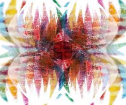 by Rik 5784 views - final score: 57.2% |
crayon idol 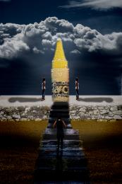 by maozbd 4621 views - final score: 56.7% | Beam us up, Scotty! 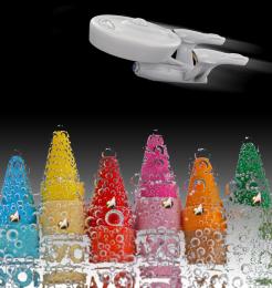 by CMYK46 6227 views - final score: 55.6% | Pxl 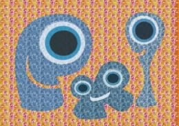 by archuarchies 5010 views - final score: 55.5% |
nameless  by maozbd 3195 views - final score: 54% |
Howdie Guest!
You need to be logged in to rate this entry and participate in the contests!
LOGIN HERE or REGISTER FOR FREE
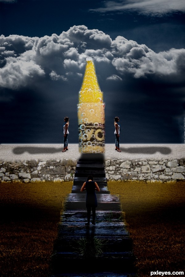
Sloppy work where the stairs meet the crayon thing. Edges of crayon are sloppy too.
promising.. but the crayon sorta spoils it
Nice
Too dark. The figure in front appears to have no head, and the crayon appears to be crooked and tilting to the left. The shadows of the people are too distorted and kind of goofy looking, not to mention the directions they are all going in signifies a very strong light source centered behind the crayon, and much lower than the lighting on top of the clouds would indicate...
This just doesn't seem to be very well thought out.
Howdie stranger!
If you want to rate this picture or participate in this contest, just:
LOGIN HERE or REGISTER FOR FREE