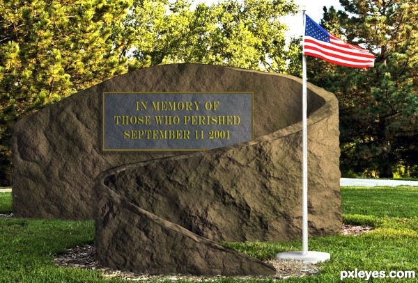
Sunday September 11, 2011 will mark the tenth anniversary of the barbaric act of terrorism committed against the United States of America. This is my simple Menhir, as a tribute to the 2,977 people that lost their lives in this horrendous act. Let freedom ring.
NEVER FORGET
http://www.fdnylodd.com/9-11-Never-Forget/Memorials/Blood-Of-Heroes.html (5 years and 3230 days ago)







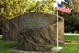




The plaque is on a curved surface & should be warped accordingly. It's also transparent.
No its not transparent and it is mounted away form the curved surface. Worry about your own entry Bob. BTW Bob, thanks for your little vote always appreciated.
If the plaque is not transparent, why do I see the rock texture through it?
The texture on the plaque sure makes it look transparent - the ridges and lines correspond with the "monument" behind it...Especially along the top edge, while the side shows no texture.
If it were mounted "away from the curved surface," there would be some sort of "gap shadow."
You may want to ignore the technical shortcomings, but other members who want to learn and improve can appreciate them being pointed out, so that they can learn what to look for in an entry. It's certainly not "worry" over your mistakes, as much as helping newer members learn what to try and avoid.
Author, what does your comment have to do with the quality of your entry and my attempt to help it improve?
fixed
GREAT for this emotional time of year... good luck author.. very clever idea
First let me say the sentiment is beautiful, the incident and the loss is very personal for most of us New Yorkers and I'm sure they'll appreciate your thoughts as will all good people of Planet Earth.
I'll be totally honest with you, when I first saw your entry I thought it was a gold border and letters on a blue tinted clear panel. I actually liked that idea, I was going to suggest a drop shadow of the type and border cast on the rock seen through the clear panel to enhance the floating look, almost looking like a futuristic memorial.
I really don't think the suggestions made were insulting or derogatory, they were worded in an academic way based on the opinions of those members. Why don't we just respect the solemn meaning of the entry and not let differences of opinion overshadow that.
Thank you Rein.
good thought author like your work good luck
Very nice tribute, author, and good work making the rock texture.
Howdie stranger!
If you want to rate this picture or participate in this contest, just:
LOGIN HERE or REGISTER FOR FREE