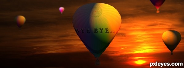
(5 years and 3148 days ago)
2 Sources:
- 1: source1
- 2: sky texture
No Wars!!!  by waiphyo 9103 views - final score: 66.4% | Fish-flavoured jelly  by JimLemon 8835 views - final score: 66.3% | Little Garden Beast  by CorneliaMladenova 7608 views - final score: 66% |
You Can Dance You Can Jive 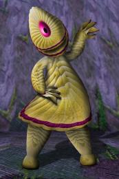 by Drivenslush 8120 views - final score: 64% | cute balls 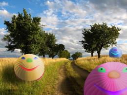 by maozbd 9024 views - final score: 61.3% | ssss...  by maozbd 5348 views - final score: 60.9% |
Enrapture 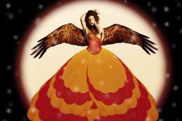 by mistic 7556 views - final score: 60.1% | Nice view 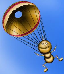 by chakra1985 3925 views - final score: 60% | Mr. Eggy  by jordyponce 3391 views - final score: 59.6% |
I like grape-balloons !  by gchiou2008 4549 views - final score: 59.4% | Bye Bye...  by maozbd 5010 views - final score: 57.4% | cactus seeds  by carmen 7636 views - final score: 55.4% |
Howdie Guest!
You need to be logged in to rate this entry and participate in the contests!
LOGIN HERE or REGISTER FOR FREE
The lighting on the top right of the balloon is inconsistent with the very obvious low sunset...
Also, the lettering looks flat, and does not conform to the shape of the balloon, in addition to being difficult to read because the left side of the image is too dark.
I'd lighten the overall image, bend the type to fit around the balloon better, and correct that top lighting.
now its better?
I think there should be no light effect on the balloon but around the balloon. Because you are facing the sun, so there should be a lights coming out from the behind of the balloon. May be it is a rays of light and it stretched out (but it should be very thin because it is a sunset). and there should be a small diffuse light on the lower right of the balloon because it face the sun and also to give it a 3d sphere shape. I also think that texts were write on the balloon, so it would be round like a balloon, so you can use a warp tool to do so.
Howdie stranger!
If you want to rate this picture or participate in this contest, just:
LOGIN HERE or REGISTER FOR FREE